
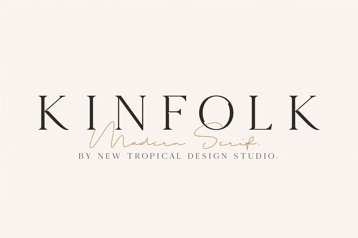
About Kinfolk Font
We see Kinfolk Font as a calm, thoughtful serif, with clean lines and a gentle modern feel. The name suggests family, home, and quiet style, and the letterforms match that mood. On Fontsbird, we look for typefaces that tell stories, and this one speaks in a soft, steady voice.
We discovered this typeface while exploring elegant print-style fonts used in lifestyle layouts and simple editorial covers. It stands out through its balanced serif shapes, careful spacing, and relaxed charm. The overall look feels refined but not stiff, making it ideal for understated visual identity work and design with a warm tone.
Font Style & Design Analysis
Kinfolk Font appears to be a modern serif typeface with a focus on clarity and elegance. The designer or foundry is not clearly credited, so we treat it as an independent display style. The general direction leans towards editorial design, with inspiration from quiet magazine layouts and bookish typography.
The letterforms tend to have slim stems, light contrast between thick and thin strokes, and gentle, tidy serifs. Overall spacing feels open, which lets words breathe on the page. This gives the font a relaxed rhythm that suits slow reading and calm, reflective content rather than loud, busy layouts.
In mood, the font family leans soft, minimal, and slightly nostalgic, like a curated lifestyle spread. The shapes support cinematic typography on still images, subtle poster lettering, and quiet branding. It is more of a display serif than a workhorse text face, ideal when you want elegance without heavy ornament.
Where Can You Use Kinfolk Font?
We see Kinfolk Font working well in branding for studios, homeware labels, slow fashion, and wellness projects. It suits wordmarks, calm logotypes, and taglines on packaging. The typeface also supports social media graphics where a soft, thoughtful serif signals trust, care, and simple beauty.
As a display-friendly font, it shines at larger sizes on magazine-style covers, posters, and YouTube or blog thumbnails. Headlines, pull quotes, and hero titles gain a gentle editorial feel. At smaller sizes it can still read, but fine details may fade, so we suggest pairing it with a clean sans-serif for long body text.
This serif typeface fits audiences who enjoy crafted objects, minimal interiors, and reflective storytelling. Designers working on lifestyle sites, lookbooks, portfolios, and soft cinematic visuals can use it to build a clear, quiet tone. Used with generous white space, it helps create a warm, human visual identity.
Font License
Before using Kinfolk Font, always check the official source for the current font licence. Some versions may allow free personal use but restrict commercial projects. For client work, logos, or paid campaigns, confirm the licence terms carefully and keep proof of purchase or permission.


