
About Tt Commons Font
When we first met the Tt Commons Font, we saw a clean, modern sans-serif typeface built for everyday use. The letterforms feel calm and balanced, with open shapes that make text easy to read on both screen and paper. It has a quiet strength that supports strong visual stories.
At Fontsbird, we study fonts by testing them in real layouts, from simple body copy to bold poster lettering. Tt Commons Font stood out because it stays clear at many sizes and blends well with other typefaces. It gives designers a flexible, friendly base for logos, web pages, and digital products.
Font Style & Design Analysis
Tt Commons Font is a geometric sans-serif font family with a modern, neutral voice. The design follows simple shapes, but it keeps enough warmth to avoid a cold, technical look. This makes the typeface useful for both serious business work and relaxed, creative projects.
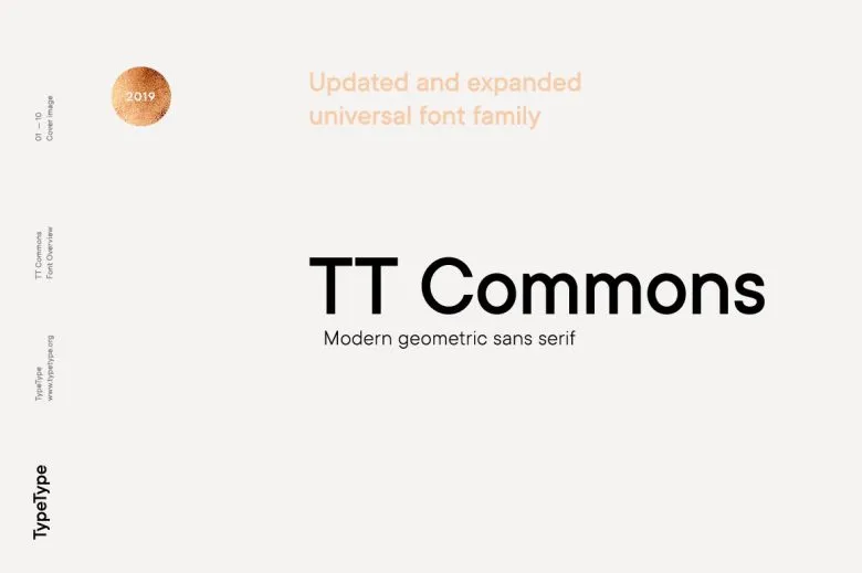
The font is widely linked with the foundry TypeType, known for clear, professional digital type design. The family usually includes multiple weights and matching italics, which helps build a full visual system. Designers can move from light captions to bold titles while keeping one stable font family.
When we study the letterforms, we see even spacing, smooth curves, and tidy vertical strokes. The capitals stand strong in headlines, giving a subtle cinematic feel on posters and thumbnails. In text, the regular weight feels calm and honest, shaping a trustworthy visual identity for brands and editorial layouts.
Where Can You Use Tt Commons Font?
We like using Tt Commons Font in brand systems, product interfaces, and web design, where clarity matters. It works well for app menus, dashboards, and buttons, because the shapes are simple and readable. For social media graphics and thumbnails, the bolder weights create sharp, modern titles.
On posters, covers, and cinematic typography, the clean geometry supports bold colour and strong images. The font stays neutral, so photos, logos, and illustration can lead the story. In small sizes, careful hinting helps the characters stay clear, making it a solid choice for long paragraphs and UI microcopy.
We also see this typeface shine in corporate reports, tech brands, and education projects that need a smart but friendly tone. Younger audiences read it easily, and adults see it as professional and steady. Paired with a contrasting display font, it anchors a full visual identity across print and digital media.
Font License
The licence for Tt Commons Font can vary by source and usage. Personal use and commercial use may sit under different terms and limits. Before using this typeface in client work, apps, or retail projects, always check the official licence from the font vendor or foundry.


