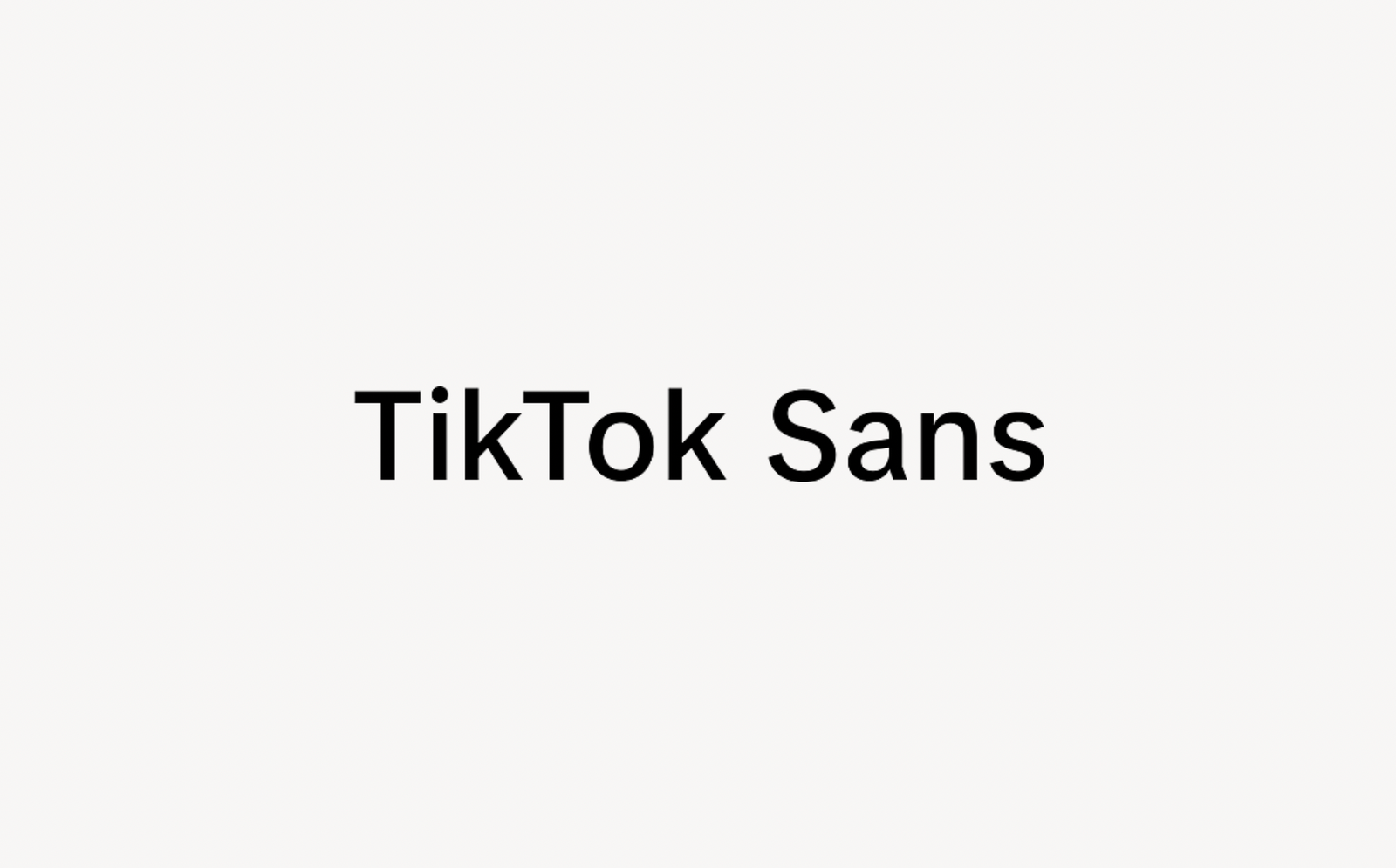
About Tiktok Sans Font
The Tiktok Sans Font feels fresh, clean, and ready for screens. We see it as a digital-first typeface that suits bold social content and modern brands. When we first looked at Tiktok Sans Font, we focused on how its clear shapes hold up in fast, scrolling feeds.
We studied its letterforms, spacing, and rhythm across mock posts, banners, and thumbnails. It stands out because it stays sharp and readable, even with bright colours and busy images behind it. For designers building a strong visual identity, this font offers a simple, no-nonsense voice that still feels current and alive.
Font Style & Design Analysis
This is a sans-serif font with a clean, digital style. The design direction leans towards flat, even strokes and smooth curves, which makes it look modern and straightforward. The overall feel is neutral but confident, so it can support many different styles of layout without stealing the whole show.
From the sources we have seen, the exact designer or foundry of Tiktok Sans Font is not clearly credited. Because of this, we always suggest checking any official documentation or trusted type source. That way, you can confirm where it comes from and how it should be used in your own projects.
The letterforms use open shapes and generous counters, which helps legibility on mobile screens. Spacing is fairly tight but still comfortable, giving a solid rhythm for headlines and short text. The weight feels balanced, with a cool, cinematic energy that suits bold titles, UI labels, and social media graphics. As a sans-serif choice, it feels both tech-aware and friendly.
Where Can You Use Tiktok Sans Font?
Tiktok Sans Font works well for social posts, video overlays, channel headers, and bold thumbnails. We also see it fitting brand systems that live mainly online, such as influencers, creators, and startups. It can support logos, wordmarks, and simple poster lettering where clarity and speed of reading really matter.
At large sizes, this typeface delivers strong impact with clear shapes that pop against photos or colour blocks. It can handle short captions or UI labels at smaller sizes, especially on screens with good resolution. We would keep longer paragraphs in another font, and reserve this one for titles, tags, and key calls to action.
Projects aimed at younger or digitally native audiences will benefit most. Think short-form video brands, app interfaces, content creators, and social campaigns. When designers want a font that feels direct, modern, and uncluttered, Tiktok Sans Font can help keep the whole layout clean while the visuals do the talking.
Font License
The licence for Tiktok Sans Font can vary depending on the source, especially for commercial work. We strongly recommend checking the official licence or trusted distributor before using it in any paid project, brand system, or client job, and confirming what is allowed for both personal and commercial use.


