
About Stoic Font
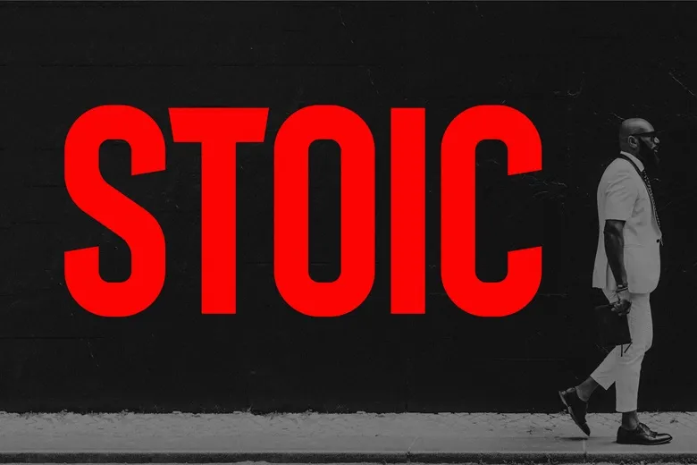
When we first saw Stoic Font, the calm strength of its letterforms caught our eye right away. The name feels fitting, as the shapes look steady, clear, and controlled. It has the mood of a classic display font, built for bold titles and serious stories.
As a team at Fontsbird, we study many typefaces, and this one stood out in our visual tests. We looked at it in mock posters, web headers, and simple logo ideas. The font held its own each time, giving a strong, thoughtful tone that supports clear visual identity.
We like how Stoic Font balances power and control, without feeling too harsh. The shapes feel grounded, which works well for cinematic typography and bold branding messages. It offers a stable look that can anchor layouts where every word needs quiet confidence.
Font Style & Design Analysis
The exact designer of Stoic Font is not clearly credited, so we always suggest checking the original foundry or trusted font library. From our study, it reads as a strong display typeface, likely in the serif or slab-leaning family, built for impact more than for long reading.
The letterforms feel solid, with firm verticals and deliberate, tidy curves. The spacing is fairly tight, which boosts the bold, cinematic feel in large titles. We see a careful balance between heavy strokes and clean inner spaces, so the words stay readable while still carrying visual weight.
Overall, the design mood of Stoic Font is serious, grounded, and slightly dramatic. It suits cinematic typography, trailer-style text, and bold cover lines. When used as a primary font family for headings, it can shape a visual world that feels disciplined, mature, and sure of itself.
Where Can You Use Stoic Font?
We see Stoic Font working best in big roles: posters, film-inspired covers, strong website headers, and social media titles. At large sizes, the shapes show their character and give a bold first impression. It adds weight to brand names, quotes, and key phrases.
For small body text, this display font may feel a bit heavy, so we prefer pairing it with a lighter supporting typeface. Used as the main heading style in a visual system, it can guide the eye and set the tone. This works well for portfolios, campaign pages, and digital thumbnails.
Brands and creators who tell serious or cinematic stories may benefit most from Stoic Font. It suits audiences who appreciate clean, firm typography with a hint of drama. Think trailers, editorial layouts, book covers, and bold statement graphics where every word should land with intent.
Font License
The licence for Stoic Font can vary by source, so it is important to check the official licensing terms. Always confirm whether your chosen version allows personal use only, or also covers commercial projects, before you use it in client work or published designs.


