
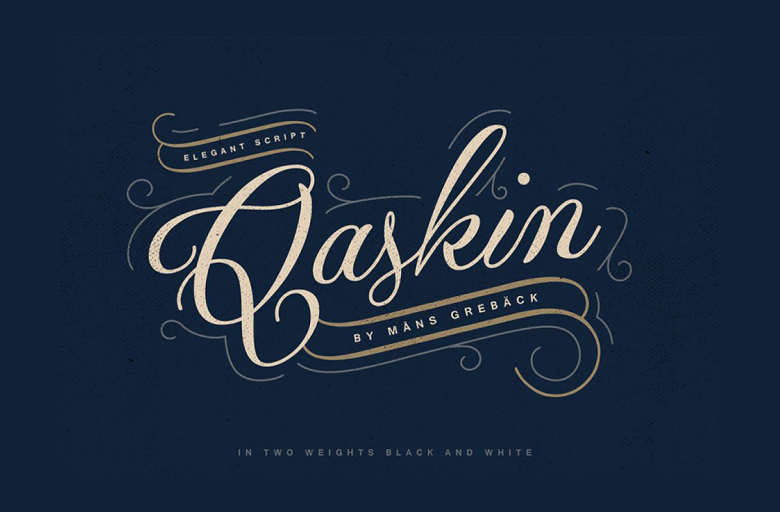
About Qaskin Font
The Qaskin Font first caught our eye while we were exploring bold display fonts for striking posters and covers. Its tall shapes and dramatic lines felt made for strong visual identity work. The letters look sharp, clear, and modern, yet still warm and welcoming.
We spent time reviewing its letterforms, testing it in titles, logos, and simple page layouts. What made Qaskin Font stand out was how it balances power and style. It looks cinematic, like a headline from a bold movie poster, but still stays easy to read in many layout styles.
Font Style & Design Analysis
From our tests, we see Qaskin Font as a strong display typeface with a modern edge. It feels built for headlines, logos, and large titles rather than body text. The designer or foundry is not clearly credited, so we treat it as an independent font family that needs careful licence checking.
The design style leans towards tall, bold shapes with even strokes. The letters have clear edges and tight curves that give a sharp, confident tone. This gives every word a sense of focus, which works well in bold branding systems and key visuals.
In use, the letter spacing feels slightly compact, which adds energy and rhythm to headlines. The weight sits in the medium-to-bold zone, giving strong contrast on both dark and light backgrounds. Overall, the mood feels cinematic and stylish, ideal for poster lettering and digital covers that need impact.
Where Can You Use Qaskin Font?
We see Qaskin Font working best in large, clear settings. Think bold branding, logo wordmarks, movie-style titles, YouTube thumbnails, and social media banners. Its strong shapes help messages stand out quickly, which is perfect for fast-scrolling feeds and busy online spaces.
On posters and web headers, the tall letterforms draw the eye from a distance. At smaller sizes, such as long paragraphs, it may feel heavy, so we suggest pairing it with a simple supporting typeface. Used as a main title font, it gives a strong, unified visual identity.
Designers working on cinematic typography, game covers, music artwork, or bold brand launches can gain a lot from this style. Youth-focused projects, entertainment brands, and creative agencies will enjoy its energy. When used with clean layouts and good contrast, Qaskin Font can quickly become the hero of the page.
Font License
Before using Qaskin Font for any project, it is vital to check the official source and licence details. Terms for personal and commercial use can differ, so we always verify the current font licence from the original provider, especially for client work or paid campaigns.


