About Publix Logo Font
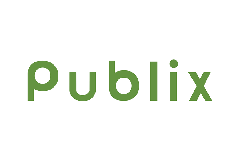
The Publix Font used in the supermarket logo is a clean, calm sans-serif typeface with a friendly mood. Its smooth round shapes feel open and modern, which suits a trusted food brand. We first looked at its letterforms by studying the logo on packaging and store signs.
As a team at Fontsbird, we pay close attention to how a brand font works in real life. The Publix Logo Font stands out because it feels simple but still human. The rounded edges and generous spacing help give this visual identity a soft, welcoming tone that many designers try to achieve.
Font Style & Design Analysis
The Publix Logo Font looks like a geometric sans-serif font family. It uses basic circles and straight strokes, especially in the curved letters. The dot of the lowercase p shape forms a clear round counters, which gives a neat and balanced look that feels very controlled and tidy.
The exact designer or foundry of the logo type is not clearly credited in public sources. Because of this, we treat it as a custom brand typeface. When a company uses a custom wordmark like this, the details are often tailor-made for the logo rather than taken from a standard retail font.
Visually, the Publix Font has medium weight strokes and wide, open spacing. This creates a relaxed, confident rhythm that reads well at distance. The soft curves and almost circular forms give it a friendly retail feel rather than cold minimalism. It works well for strong branding and clean, clear display typography.
Where Can You Use Publix Logo Font?
Because the Publix Logo Font is tied to a major supermarket, we would not copy it exactly for another main logo. Still, its style gives helpful clues. A similar rounded sans-serif typeface can work well for grocery brands, children’s products, health shops, and any soft, people-first visual identity.
At large sizes, this style of display font feels bold yet gentle, perfect for shop signs, packaging titles, thumbnails, and social media headers. The open shapes also stay clear in smaller print, such as labels, menus, and basic web UI. Simple geometric letterforms tend to hold their shape well on screens.
We often suggest a Publix Font-style typeface for designers who want trust, care, and everyday comfort in their message. It suits family audiences, lifestyle brands, and friendly service websites. Paired with a neat secondary font for body text, this rounded branding typeface can create a calm, reliable system across print and digital work.
Font License
The exact Publix Logo Font used in the brand appears to be a custom corporate typeface, so it is not freely available for public use. For any similar Publix Font alternative, always read the official licence and source carefully, especially before using it in client projects or other commercial design.


