
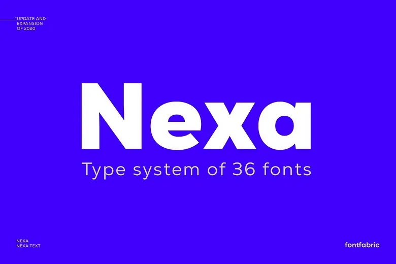
About Nexa Font
The Nexa Font is a clean, strong sans-serif typeface that feels modern and friendly. We first noticed it while exploring bold branding design and sharp poster lettering for digital campaigns. Its simple shapes and smooth curves make every word look neat and easy to read.
At Fontsbird, we study how letterforms behave in real layouts, not just samples. Nexa stands out because it balances a geometric look with a warm tone, so it never feels cold or stiff. This mix of clarity and character gives designers a strong base for logos, titles, and clean visual identity work.
Font Style & Design Analysis
Nexa is a geometric sans-serif font family with a strong focus on clarity and rhythm. It belongs to the same broad family of clean typefaces we see in smart tech brands and clear wayfinding design. The designer and foundry are commonly linked with modern digital type design, but detailed credit is not always clearly stated in every source.
The letterforms use simple circles and straight lines, giving the typeface a tidy, engineered feel. Stroke widths stay even, which keeps the texture of text smooth on both screen and print. Spacing is generous, so words feel open, not cramped, even in dense typography layouts.
Different weights of Nexa Font move from light and airy to bold and commanding. The heavier cuts work well for cinematic typography, loud headlines, and punchy social graphics. Lighter styles feel calm and factual, great for UI labels, menus, and captions where a neutral, professional mood is key.
Where Can You Use Nexa Font?
The Nexa Font fits a wide range of projects, from solid branding systems to simple web design. It works well in logos, app interfaces, packaging, and clean corporate documents. Because the shapes are straightforward, different audiences, from children to professionals, can read it without effort.
At large sizes, Nexa becomes a powerful display font for posters, YouTube thumbnails, hero banners, and bold title design. The clear geometry makes each letter feel sharp on high-resolution screens. When we test it in mock-ups, it holds its structure even on busy photo backgrounds.
In smaller text, the open counters and steady rhythm keep paragraphs readable on both print and digital layouts. For product sheets, pitch decks, and clean editorial spreads, this typeface gives structure without stealing the show. Teams needing a unified visual identity across social, web, and print can rely on Nexa for a consistent tone.
Font License
The Nexa Font may have different licence terms for personal and commercial projects, depending on the source. Before using it for client work, branding, or paid campaigns, we always advise checking the official licence details and downloading only from trusted, legal font providers.


