About Klavika Font
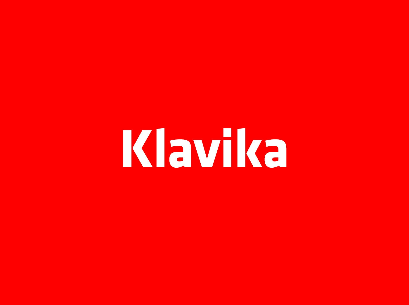
The Klavika Font is a clean, geometric sans-serif typeface that feels both modern and steady. We first met it while studying strong brand identity systems and bold interface design. Its clear shapes and calm rhythm make it ideal for designers who value order and clarity.
As a creative team at Fontsbird, we look closely at how each set of letterforms tells a story. With Klavika Font, we noticed its quiet power. It does not shout, yet it gives layouts a firm, professional voice that works well in digital and print work.
Font Style & Design Analysis
Klavika Font belongs to the family of humanist sans-serif typefaces, designed by Eric Olson for the foundry Process Type Foundry. The style mixes simple geometric forms with gentle human touches. This blend makes it feel less cold than strict grid-based faces, while still looking very precise.
The letterforms have open counters, balanced stroke widths, and tidy spacing. The capitals stand strong for bold titles, while the lowercase keeps long text readable. Its weights move from light to bold without sudden jumps, giving designers smooth control over visual emphasis and hierarchy.
We often read Klavika Font as having a subtle, cinematic design tone, especially in heavier cuts. It suits sharp visual identities, user interfaces, and structured poster lettering. The mood is confident but not loud, making it perfect when you need trust, clarity, and a slightly technical edge.
Where Can You Use Klavika Font?
We see Klavika Font working beautifully in strong branding, clear logos, and organised web design. Its firm shapes support interface labels, menus, and buttons. For product packaging or business stationery, it adds a smart, tidy voice that suits modern, tech-driven, or design-aware brands.
On large posters, social media graphics, or video thumbnails, the bolder weights stand out without feeling aggressive. The straight lines and open forms stay legible across screens and print. Even when viewed at a distance, the overall silhouette remains distinct and easy to scan quickly.
At smaller sizes, the generous openings in the letterforms help reading on mobile devices and dense dashboards. That makes it useful for reports, UI labels, and short blocks of copy. Audiences who value clarity, structure, and a slightly technical personality will respond well to this carefully built font family.
Font License
Klavika Font is a commercial typeface, and rights for personal and business use depend on the licence you buy. Before using it in logos, apps, or large client projects, always check the official licence details from the authorised source to confirm what is allowed.
Every strong layout starts with the right voice, and Klavika Font can be that voice when you need order, clarity, and quiet strength.


