
About Fair Prosper Font
The Fair Prosper Font is a bold, flowing script that feels ready for the spotlight. When we first saw it, the letters looked like confident handwriting on a classic film poster. It has a strong presence, with sweeping strokes that stand out on any page or screen.
At Fontsbird, we study typefaces by testing them across posters, thumbnails, and simple branding mockups. With Fair Prosper Font, the energy of the curves and the rhythm of the letters caught our eye straight away. It feels dramatic yet friendly, perfect for creative work that needs impact.
This typeface stands out because every stroke feels deliberate. The joined letterforms create a clear, stylish line, which helps build a recognisable visual identity. For designers who enjoy strong, expressive typography, this font brings a touch of cinematic flair without feeling fussy or hard to read.
Font Style & Design Analysis
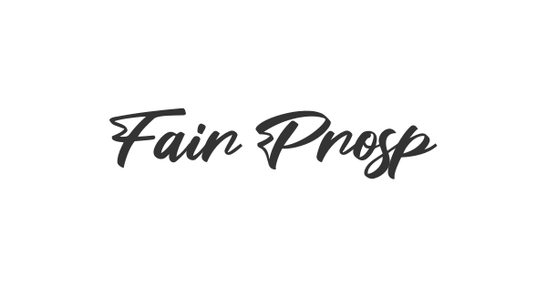
This is a cursive font with bold, connected strokes and a confident display style. The letters flow together like quick handwriting, but with enough weight to feel firm and grounded. As a result, it works well as a display font where personality and movement matter more than strict neutrality.
The designer or foundry behind Fair Prosper Font is not clearly credited across common font directories. Because of this, we always suggest checking the original source whenever you plan real projects. That way, you stay sure about both authorship and licensing before you share or sell your work.
Visually, this cursive typeface has tall, sweeping capitals and rounded lowercase forms. The strokes are thick, with smooth curves and tight letter spacing that keep words compact and powerful. The mood leans dramatic and cinematic, making it ideal for poster lettering, strong titles, and bold social media graphics where style leads the message.
Where Can You Use Fair Prosper Font?
Fair Prosper Font works best as a display font for big, bold text. We like it on branding experiments, YouTube thumbnails, banners, and striking social posts. It can also fit short headlines on websites or print covers where you want a handwritten edge that still feels clear and strong.
Because the strokes are thick and the letters connect closely, it shines at large sizes. At smaller sizes, the details may feel tight, especially in long paragraphs. We suggest using it for titles, logos, and short taglines, then pairing it with a simple body typeface for longer reading.
This font suits audiences who enjoy expressive, cinematic typography and bold, stylish visuals. Creative brands, entertainment projects, streetwear labels, and content creators can all use it to build a strong visual identity. When used with care and spacing, Fair Prosper Font can turn even a short word into a memorable statement.
Font License
Before using Fair Prosper Font for client work, products, or any paid project, always check the official licence from the original source. Many fonts allow free personal use but need a proper commercial licence. Staying informed keeps your design work safe, fair, and fully professional.


