
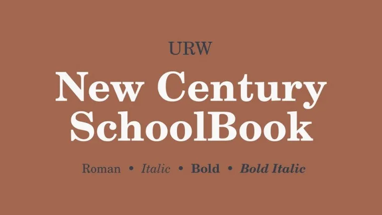
About Century Schoolbook Font
The Century Schoolbook Font is a classic serif typeface that many of us first meet in school books and learning materials. Its calm, open letters feel familiar and friendly. We see it as a bridge between traditional print design and clear, modern reading needs.
At Fontsbird, we looked at this typeface across textbooks, reports, and digital layouts. We studied how the shapes guide the eye along a line of text. The Century Schoolbook Font stands out because it combines old-style charm with strong readability, making it a quiet hero in everyday typography.
Font Style & Design Analysis
This is a serif font with a steady, bookish personality. The letterforms have balanced strokes and gentle contrast, which keeps reading smooth and relaxed. It feels reliable and thoughtful, ideal for long passages, learning content, and any project that needs trust and clarity.
The original designer of Century Schoolbook Font is linked historically to the broader Century family, but the exact designer credit can be unclear in many digital releases. Because of this, we always suggest checking the type foundry or source you use for proper creator and licence details.
Visually, the rounded counters, wide spacing, and sturdy serifs create a soft yet firm rhythm on the page. The weight feels moderate and honest, never showy. This classic serif structure gives it a gentle, almost cinematic book-title mood, ideal for print covers, editorial layouts, and calm, trustworthy branding.
Where Can You Use Century Schoolbook Font?
The Century Schoolbook Font works wonderfully in textbooks, children’s workbooks, and reading guides, thanks to its open shapes. It also suits reports, essays, and long-form web articles where comfort is vital. For designers, it can anchor visual identity systems that need a warm, academic tone.
At large sizes, the letterforms look strong and traditional, perfect for chapter titles, editorial headings, and poster typography with a literary feel. At smaller sizes, the wide shapes and clear serifs help letters stay legible, even in dense paragraphs or footnotes.
This typeface is a smart pick for schools, publishers, nonprofits, and heritage brands. It speaks well to parents, teachers, and readers of all ages. When paired with a clean sans-serif, the Century Schoolbook Font can bring balance to modern websites, social media graphics, and digital reading experiences.
Font License
Different versions of Century Schoolbook Font may have different licences, especially between desktop and web use. Personal use is often more flexible, but commercial projects may need a paid or specific licence. Always check the official source or foundry before using it in client or commercial work.


