
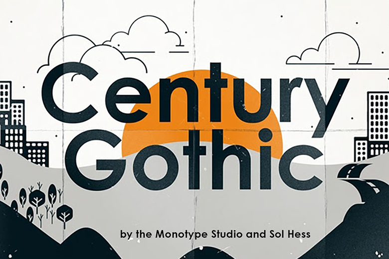
About Century Gothic Font
We see Century Gothic Font as a clean, modern classic in the world of sans-serif typography. Its smooth circles, tall letters, and simple shapes feel bright and open. Many designers use it when they want a calm, modern look without losing warmth or character.
At Fontsbird, we first studied this font family through posters, web layouts, and bold headline designs. We noticed how its clear letterforms hold up in both print and digital work. It stands out because it feels timeless, yet still fresh, and supports clear visual storytelling.
This strong mix of geometry and friendliness makes Century Gothic Font a favourite for clean branding, stylish slides, and simple, readable layouts. Its neat shapes support a wide range of visual identities, from relaxed lifestyle brands to sharper, tech-focused projects.
Font Style & Design Analysis
Century Gothic Font is a geometric sans-serif typeface, which means most letters use circles and straight lines. It feels close to classic modern designs, with a high x-height and wide shapes that open up the text. This creates a light, airy feeling on the page.
The design is commonly linked to Monotype, and it clearly follows the tradition of early twentieth-century geometric type design. While full historical credit can be complex, it is widely treated as a modern, digital-focused update of that style. We see it as a bridge between past and present.
The letterforms have round bowls, clean terminals, and generous spacing, which helps with simple reading and strong impact. In headlines, this font can look cinematic and bold, especially with large tracking. In body text, it feels soft and approachable, though some find it better for short paragraphs than long reports.
Where Can You Use Century Gothic Font?
We like using Century Gothic Font for bright, modern branding, simple logos, and clean website headers. It also works well on posters, YouTube thumbnails, and social media graphics where short, punchy messages are key. The rounded shapes feel friendly, which helps brands appear open and honest.
At large sizes, this display font shows off its smooth curves and balanced strokes, perfect for covers, titles, and bold cinematic typography. At smaller sizes, it remains readable in menus, captions, and short blocks of copy, especially on screens with good resolution and clear spacing.
This typeface suits tech companies, lifestyle brands, education projects, and minimal portfolios. It speaks well to younger audiences who enjoy clean, digital-first design, but it also fits professional decks and reports. If a project needs simple clarity with a modern voice, this font is a strong choice.
Font License
Use of Century Gothic Font can differ between personal and commercial projects, depending on the source. Some platforms bundle it with software, while others sell licences. Before using it for client work, logos, or products, always check the official font licence details and terms.


