
About Oasis Font
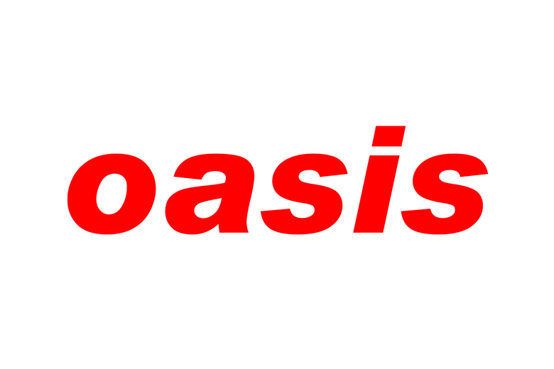
When we first looked at Oasis Font, we saw a bold, retro feeling typeface with a clear link to classic album covers and strong poster lettering. It has a clean shape that still feels loud, so every word stands out on screen and in print.
As a team at Fontsbird, we studied how this display font behaves in real layouts, from simple logos to dramatic title cards. The mix of sharp edges and firm spacing gives it a confident voice. That mix of clarity and attitude is what makes this typeface so memorable in modern visual identity work.
Font Style & Design Analysis
Oasis Font works mainly as a strong display typeface, built for big titles rather than long reading text. The exact designer or foundry is not clearly credited in common sources, so we treat it as a styled headline font with a bold, straightforward structure.
The letterforms sit in a firm geometric frame, with steady vertical strokes and tight, even spacing. The shapes feel slightly boxy, which adds impact to each word. This gives the font a modern yet slightly retro tone that fits well with cinematic typography, music branding, and attention-grabbing headers.
Most weights we see for Oasis Font lean toward the bold side, so the texture on a page is heavy and solid. The mood is confident, urban, and clear. Used in the right colour and layout, the font can echo the feel of classic band logos while staying clean enough for current brand design.
Where Can You Use Oasis Font?
We reach for Oasis Font when a project needs a bold voice in a small space. It works well for logos, album-style covers, social media thumbnails, and streaming banners. On posters and flyers, it helps short titles stand out, even from a distance, thanks to its firm shapes.
Because this typeface is quite heavy, it shines at large sizes on screen and in print. At very small sizes, the strong strokes can feel cramped, so we would keep it for headings, labels, and buttons rather than long paragraphs. Pairing it with a simple sans-serif or light serif body font creates a balanced visual rhythm.
Different audiences respond well to this style of bold display lettering. Music fans, film lovers, and streetwear communities all tend to enjoy its assertive look. If your project needs a punchy, high-energy headline font for a visual identity, Oasis Font can help the message land fast and stay in mind.
Font License
Before using Oasis Font for any personal or commercial project, we always suggest checking the official source for the current font licence terms. Usage rules can change, so confirm whether your planned logo, print run, or client work is covered by the licence you obtain.
Every strong design begins with a clear voice, and the right typeface can make that voice unforgettable.


