About Dell Font
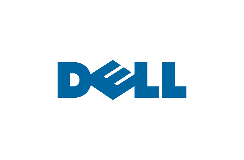
When we talk about Dell Font, most people think of the clean logo used by the tech brand Dell. The wordmark uses a simple geometric sans-serif typeface with a tilted “E”, which gives the letters a sharp, modern look that feels both friendly and professional.
As type lovers at Fontsbird, we study how this kind of brand typography works in the real world. The style of the Dell logo font stands out because it is easy to read, strong at a distance, and carries a calm corporate mood. It shows how a clear font choice can support a trusted visual identity.
Font Style & Design Analysis
The term Dell Font usually refers to the custom sans-serif typeface used in the official Dell wordmark. It is geometric and minimal, with simple strokes and low contrast. Most sources suggest that the exact designer and foundry are not clearly credited to the public.
This logo typeface feels close to clean geometric families like Futura or Avenir, but it is adjusted for the brand. The letters have open shapes, balanced spacing, and a steady weight. The famous tilted “E” becomes a strong design motif that adds energy without breaking legibility.
As a piece of corporate typography, the Dell logo font aims for clarity first. The rounded forms soften the sharp geometry, giving a human tone to a tech-focused brand. This makes the type suitable for screens, packaging, and simple cinematic branding moments, where a calm, stable mood is key.
Where Can You Use Dell Font?
Because the real Dell Font is a protected brand asset, we do not copy or reuse it. Instead, we look at how similar sans-serif fonts can work in design. Clean geometric faces inspired by this style suit tech branding, app interfaces, product packaging, and modern visual identity systems.
Fonts in this style perform very well at large sizes, making them ideal for logos, hero headlines, thumbnails, and bold poster lettering. The simple letterforms also scale down nicely for UI labels, web navigation, and print body text, as long as spacing and weight are chosen with care.
This kind of brand-focused typeface works best for projects that want trust, order, and a slight futuristic edge. Start-ups, software tools, device makers, and education platforms can all benefit from a clear, steady font family that echoes the polished tone we see in the Dell logo typography.
Font License
The official Dell Font used in the brand logo is protected and not a general-use typeface. For personal or commercial projects, designers should pick a similar licensed sans-serif font and always check the official licence or source carefully before any paid or public use.


