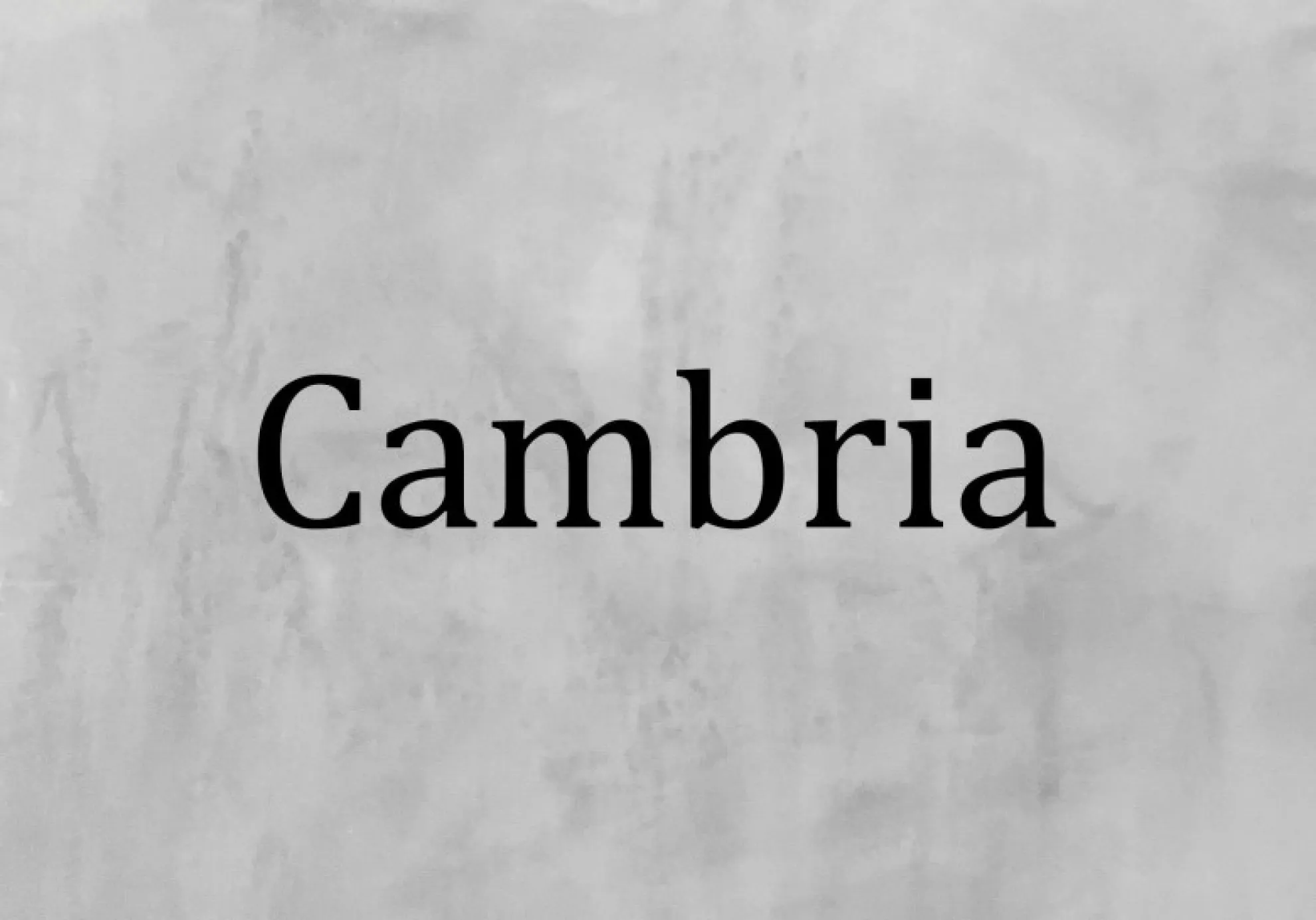
About Cambria Font
We see Cambria Font as a calm, steady voice in the world of serif typefaces. It was designed for clear reading on screen and in print, so every line feels ordered and easy on the eye. On our Fontsbird desk, it often appears in long texts and serious layouts.
We first studied Cambria while comparing classic document fonts for smooth digital reading. Its clear letterforms, balanced contrast, and tidy texture stood out at once. It looks modern but still rooted in traditional book typography, which gives writers and designers a trustworthy, professional tone.
What makes Cambria Font special is how it keeps detail without losing simplicity. The shapes feel sturdy, the rhythm is even, and the serifs stay quiet, not showy. This gives documents, reports, and subtle visual identities a serious yet friendly character that many other system fonts do not match.
Font Style & Design Analysis
Cambria is a modern serif typeface in the transitional style, designed for body text and comfortable reading. It sits in the same broad family of text faces as Times New Roman, but it feels more open and screen‑friendly. It belongs to the standard ClearType collection on many systems.
The font is widely known to be designed by Jelle Bosma for Microsoft, with input from other type experts. It was built around ClearType rendering, so the outlines work well at small pixel sizes. That history gives the typeface a strong link to digital documents and office use.
Visually, Cambria Font has moderate contrast, solid vertical stress, and short, practical serifs. The spacing is generous, so words breathe nicely without looking loose. In headlines, it can carry a gentle, editorial mood, while in paragraphs it fades into the background, supporting reports, articles, and even low‑key cinematic typography in subtitles or captions.
Where Can You Use Cambria Font?
We like using Cambria in long‑form documents, research papers, and printed reports where clarity is key. It also works well for simple brand guidelines, letterheads, and proposals. If a project needs a calm, serious voice, this typeface can support that tone without drawing too much attention.
At small sizes, Cambria Font keeps its shape and stays readable on screens and low‑cost printers. That makes it a safe choice for web copy, emails, and forms. At larger sizes, like slide titles or modest poster lettering, it gains a bit more presence but still feels restrained and professional.
Because of this balance, we often suggest Cambria for education materials, legal and financial texts, classic editorial layouts, and subtle visual identities that avoid flashy display fonts. It may not suit loud gaming thumbnails or bold cinematic logos, but it shines where trust, order, and long reading comfort matter most.
Font License
The Cambria Font licence is usually tied to the software or operating system that installs it, such as Microsoft Office or Windows. Rules can change, so always check the official licence or trusted source before using it in any paid, commercial, or client project.


