
About Winnie The Pooh Font
The Winnie The Pooh Font style feels warm, playful, and full of childhood charm. The bouncy letterforms look hand-drawn, like a friendly note on a storybook cover. We see a cosy mix of fun, fantasy, and clear reading, which suits family projects and gentle branding.
At Fontsbird, we studied fan-made versions and typefaces inspired by the classic Disney artwork. We looked at shape, line weight, and how the font family behaves in titles and short quotes. It stands out because it captures soft, nostalgic energy without feeling messy or hard to read.
For us, this style of display font shows how storytelling and typography can work together. It instantly suggests honey pots, forests, and friendship. That makes it powerful for designers who want a light, heartfelt tone in their visual identity or simple poster lettering.
Font Style & Design Analysis
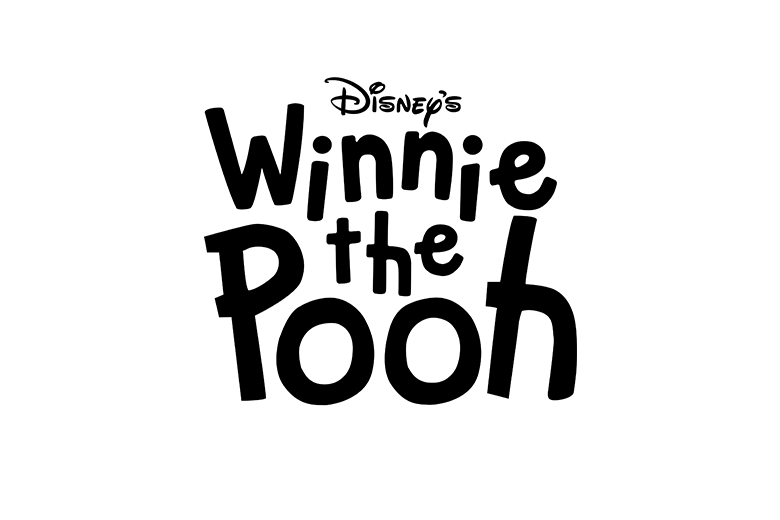
The typical Winnie The Pooh Font inspired style sits between a playful handwritten typeface and a relaxed comic display font. It is not a strict, formal design. Instead, it feels like neat handwriting drawn with a soft pen, made for headings and characterful titles.
The exact designer or foundry for many Pooh-style fonts is often unclear, and different versions exist online. Because of this, we always suggest checking each specific typeface page for clear credit, release notes, and any official link to Disney or other rights holders before use.
Visually, the letters usually have uneven strokes, rounded corners, and gentle spacing, which adds charm to the letterforms. The weight is medium to bold, so it works well as a display choice for titles, posters, and cinematic typography. The mood is calm, friendly, and nostalgic, ideal for soft storytelling projects.
Where Can You Use Winnie The Pooh Font?
The Winnie The Pooh Font look is perfect for children’s book covers, birthday posters, classroom signs, and family event invites. It also works on social media graphics, YouTube thumbnails, and cosy blog headers where a warm, storybook voice helps the visual identity feel welcoming.
Because this style is a bold display font, it shines at large sizes, such as titles, hero images, and simple branding wordmarks. At very small sizes, the playful shapes can lose clarity, so we suggest pairing it with a clean sans-serif or serif typeface for longer text and body copy.
Designers creating work for young audiences, parents, teachers, and nostalgic fans gain a lot from this friendly typeface. It suits playful learning materials, family-focused packaging, and gentle poster lettering for community events. Used with care, it can turn a simple heading into a warm, memorable story moment.
Font License
Many fonts marketed as Winnie The Pooh Font are fan-made and may only allow personal use. Some may forbid commercial projects or need a paid licence. Always read the official licence on the source site and confirm rights before using any version in client or paid work.


