About S-core Dream
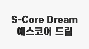
S-core Dream is a clean, modern sans-serif font that feels calm and friendly. When we first tested S-core Dream, we noticed how simple the shapes are, yet how strong the letters look on screen. It gives words a soft, clear voice without extra fuss.
At Fontsbird, we explore type by placing it in real layouts, like posters, web headers, and app screens. This font stood out because its smooth curves and open spacing work well in many styles. It can feel both playful and serious, so it fits a wide range of visual stories.
We also enjoy how this typeface supports neat, readable text blocks while still looking sharp in bold titles. That mix of clarity and character makes S-core Dream a smart choice for designers who want a modern, flexible font family.
Font Style & Design Analysis
This is a sans-serif font with a gentle, modern style. The strokes are even and tidy, without decorative endings. The overall design direction is clean and human, built for simple reading and friendly branding. It feels like a practical everyday typeface that still brings a sense of polish to any layout.
The designer or foundry behind S-core Dream is not clearly credited in common sources. Because of this, we always suggest tracing it back to the original publisher or trusted font library before use. That way, you can confirm both authorship and licence details with confidence.
Looking closer at the letterforms, we see rounded corners, open counters, and balanced spacing. The weights move smoothly from light to bold, which helps create contrast in titles and body text. Its calm mood works well for visual identity, editorial layouts, and even soft cinematic typography where clarity and warmth matter.
Where Can You Use S-core Dream?
S-core Dream suits many tasks, from brand systems to digital products. It works well in logos, app interfaces, and social media graphics, where a clean sans-serif voice is needed. For posters and thumbnails, the bolder weights give strong, simple titles that stand out without looking harsh.
At large sizes, this font looks smooth and confident, ideal for hero headings, banners, and key campaign lines. The simple shapes scale nicely on high-resolution screens and printed materials. At smaller sizes, its open letterforms keep text readable in menus, captions, and longer paragraphs.
We would use this typeface for brands that want a modern but kind tone, such as tech start-ups, lifestyle products, education, or health. It also fits clean editorial design, light-hearted poster lettering, and user-friendly websites that need clear navigation and approachable text.
Font License
The licence for S-core Dream can vary by source, and terms may differ for personal and commercial use. Before using it in paid projects, we strongly recommend checking the official licence or trusted distributor, so you understand usage rights, limits, and any required credits.


