
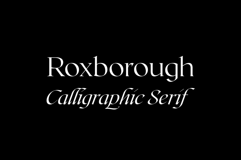
About Roxborough Cf Font
The Roxborough Cf Font is a calm and classic serif typeface with a warm bookish feel. We first noticed it while exploring elegant text fonts for long reading on Fontsbird. Its gentle curves and sharp details give it a strong yet soft visual identity that feels timeless.
We spent time testing this font family in body copy, titles, and mock poster lettering. It stood out because the letterforms keep a graceful flow, even in tight layouts. This mix of comfort and clarity makes Roxborough Cf Font a smart choice for designers who care about readable, story-driven type.
Font Style & Design Analysis
Roxborough Cf Font is a modern serif typeface designed for text but with enough personality for titles. The exact designer or foundry is not clearly credited across common sources, so we treat it as an independent serif with a strong book and editorial feel.
The letterforms have fine serifs, moderate contrast, and slightly soft edges that add warmth. Spacing feels careful and even, which helps long paragraphs stay smooth. In headings, the higher weight options deliver a subtle display font effect, without looking loud or forced.
On screen, the shapes support clean reading, while in print they create a refined, almost literary typography mood. At larger sizes, the curves and terminals show delicate detail that hints at cinematic typography, ideal for covers, title cards, and polished editorial layouts.
Where Can You Use Roxborough Cf Font?
We see Roxborough Cf Font working beautifully in thoughtful branding, book interiors, and calm website typography. It suits cultural projects, studios, and makers who want a serious but human tone. On posters or thumbnails, it gives a classic, confident voice without stealing all the attention.
At large sizes, this typeface shows its curves and contrast, making it great for headlines, chapter titles, and cinematic opening frames. At smaller sizes, the clean structure and steady rhythm keep paragraphs readable, which helps blogs, articles, and long-form storytelling stay easy on the eyes.
Different audiences can benefit: schools, publishers, small brands, and content creators who value clear, grown-up lettering. We like pairing it with a simple sans-serif for captions or UI text. Together, they build a balanced visual identity that feels crafted rather than trendy.
Font License
Before using Roxborough Cf Font for any paid client work or wider commercial use, we strongly suggest checking the official source and licence terms. For personal projects, terms may differ, so always read the current licence details to stay safe and fully compliant.


