About Roobert Font
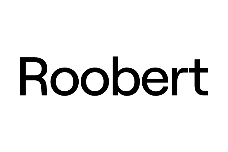
The Roobert Font is a clean, modern sans-serif typeface with a friendly edge. We first met it while exploring bold digital font families for bright web and app layouts. Its rounded shapes and calm rhythm make it feel technical, but still warm and human.
When we studied its letterforms in different sizes, we saw how steady and clear it stayed on screen. This makes Roobert Font a strong choice for designers who want a simple, trustworthy visual identity that still looks fresh and slightly playful.
Font Style & Design Analysis
Roobert Font belongs to the modern geometric sans-serif family. Its style follows clear shapes and simple strokes, with no extra decoration. The designer or foundry is not always clearly credited online, so we treat it as a careful, well-built digital typeface rather than a historic revival.
Many letters use near-perfect circles and straight lines, which gives the glyphs a balanced, engineered feel. The spacing feels open, so words breathe and stay easy to read. In heavier weights, this creates strong poster lettering that looks bold without feeling aggressive.
The mood of Roobert Font leans clean, bright, and slightly tech-driven, which works well for modern branding and simple user interfaces. At large sizes, its shapes feel almost like soft cinematic typography, ready for titles, streaming graphics, or clear social media layouts.
Where Can You Use Roobert Font?
Roobert Font suits many roles, from sharp logo design to app UI labels, social media titles, and light editorial work. Its modern look fits tech brands, creative studios, and lifestyle products that want a clean but friendly visual voice without fuss.
At large sizes, this display font shines in bold headlines, hero banners, and video thumbnails. The round structure keeps big text smooth and readable. At smaller sizes, the open counters help the letterforms stay clear on screens, menus, and navigation labels.
We like using Roobert Font for fresh web layouts, minimal packaging, digital products, and bright presentation decks. It works especially well for audiences who enjoy simple, honest typography with a hint of playful geometry. Used with care, it can carry a full brand system on both web and print.
Font License
Before using Roobert Font for client work or any paid project, always check the official font licence from the original source. Some versions may allow personal use, while commercial use can need a separate licence. When in doubt, read the terms or ask the rights holder.
Every clean line in Roobert Font can help a story stand out; we simply need to use it wisely and legally.


