About Playboy Font
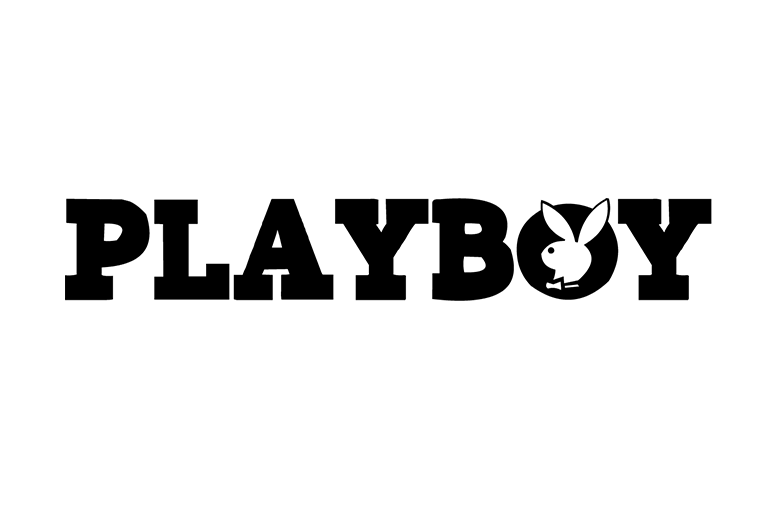
The Playboy Font is a bold display typeface linked in many minds with the classic Playboy magazine logo and its famous rabbit symbol. When we study this style, we see strong, sharp letterforms that feel glamorous, grown up, and a little bit rebellious on the page.
We first looked at this style while exploring vintage magazine typography and logo trends for our work at Fontsbird. It stands out because its heavy shapes and clear contrast create a powerful visual identity. Designers use this look when they want a confident, adult tone that still feels playful and stylish.
Font Style & Design Analysis
The design often sold or shared as Playboy Font is usually a strong display or serif typeface, built for logos and big titles rather than long text. The forms are tight and confident, with solid vertical strokes and sharp corners that give the letters a clean but striking presence.
The exact original typeface and its designer are not always clearly credited in public sources, as the Playboy logo developed over time. Many digital versions try to echo that logo style. We see different font families online, each interpreting the same glamorous, mid-century magazine look with their own small twists.
Most versions feature tall capitals, tight spacing, and thick to medium weight, which makes them ideal for cinematic titles and bold branding. The mood feels luxurious, adult, and a little retro. Used well, this style can give posters, covers, and social banners a strong, editorial character with instant impact.
Where Can You Use Playboy Font?
A typeface in the style of the Playboy Font works best in projects that need a bold statement. It suits logo concepts, magazine-style covers, YouTube thumbnails, social media titles, and fashion or nightlife posters. The dramatic letterforms help grab attention in busy feeds or crowded print layouts.
This sort of display font family performs best at large sizes, where the shapes and curves stay clear and sharp. At very small sizes, the tight spacing and heavy strokes can feel cramped, so we suggest pairing it with a simpler sans-serif for body text. That mix keeps the design readable and balanced.
Brands and creators working in style, entertainment, or beauty often benefit from this bold, editorial typography. It can work for concept moodboards, mock-ups, and fan art inspired by vintage magazines or cinematic posters. When used with care, it adds a confident, glamorous voice that helps a design tell its story.
Font License
Many fonts promoted as a Playboy Font are fan-made or unofficial, and their licences can differ a lot. Always read the licence notes closely, and check the official source or foundry before using any version for paid client work or commercial branding.
