
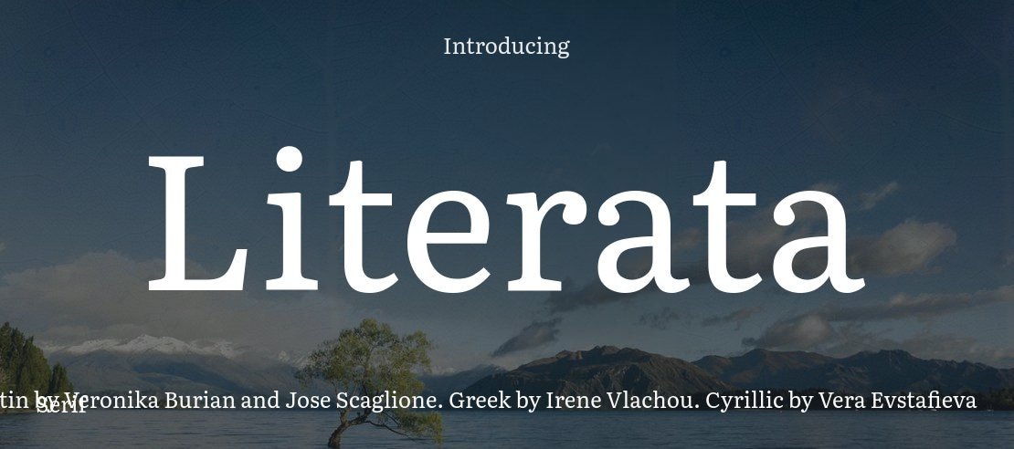
About Literata Font
The Literata Font is a warm, book-friendly serif typeface that feels calm and thoughtful on the page. We first noticed it while exploring digital reading projects, where every curve and serif must stay clear and gentle for long hours of reading.
At Fontsbird, we look for typefaces that balance character with comfort. Literata Font stands out because its letterforms feel human, yet very tidy. It supports storytelling, essays, and articles without shouting for attention, which makes it a quiet hero in modern typography.
Font Style & Design Analysis
This is a serif font with a clear, literary voice. The overall design feels like a modern book face, shaped for screens as much as paper. Sturdy stems, soft curves, and modest contrast give Literata Font a stable rhythm, ideal for paragraphs and long reading sessions.
The original designers behind Literata are commonly credited as TypeTogether, working on a custom type family for reading environments. Different sources may list updates or expansions, so we always suggest checking the most recent notes from the official type provider for full design credits.
Visually, the letterforms show gentle contrast, open counters, and well-paced spacing. The serifs are tidy and slightly tapered, which helps guide the eye along each line. It feels bookish yet fresh, with a soft cinematic typography mood that can support covers, chapter titles, and refined brand voices without looking stiff.
Where Can You Use Literata Font?
Literata Font works beautifully in long-form text, like ebooks, blogs, and reading apps, where comfort matters most. It suits editors, educators, and writers who want a clear, trustworthy voice. For brands, it can support thoughtful messaging, especially in sectors such as culture, publishing, or education.
At small sizes, the open shapes and careful spacing help words stay crisp and readable. On high-resolution screens, body text remains sharp, and headings feel refined, not loud. In print, the serif details shine on book pages, brochures, and editorial layouts with a calm, literary feel.
We also like using Literata for subtle visual identity systems, social media quotes, and video captions where a book-style tone fits the story. It pairs well with clean sans-serif display fonts, allowing strong poster lettering or thumbnails while keeping text blocks smooth and easy on the eyes.
Font License
Before using Literata Font for client work or commercial projects, always check the official source for the latest licence terms. Many fonts allow personal use more freely than commercial use, so we recommend reading the licence details carefully each time.


