
About Grave Presso Font
The Grave Presso Font is a bold sans-serif typeface with a strong, modern voice. Its clean shapes feel sharp and direct, yet there is a playful edge that suits eye-catching titles and posters. We see it as a font that demands attention without feeling messy.
We first looked at Grave Presso Font while exploring striking headline type for dark, moody layouts. We studied its curves, spacing, and rhythm across different words and phrases. It stands out for designers who want a simple structure with a dramatic twist that still reads clearly at a glance.
On Fontsbird, we value fonts that tell a story, and this typeface feels ready for bold branding, game covers, and cinematic graphics. Its strong forms create a visual beat that helps build memorable poster lettering and powerful visual identity systems.
Font Style & Design Analysis
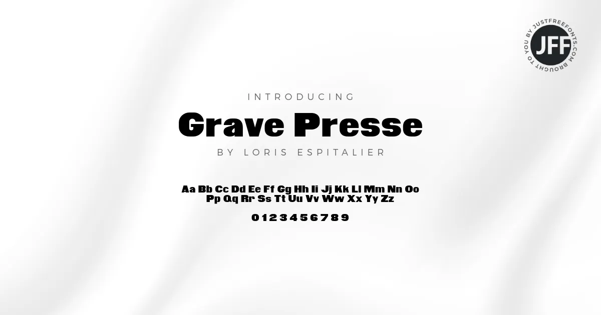
This is a sans-serif font, built around solid, blocky letterforms and straight edges. The design direction leans towards display use, with heavy strokes and tight shapes. It feels more like a headline star than a quiet body text choice, giving designs a punchy, graphic tone.
The designer or foundry of Grave Presso Font is not clearly credited in common sources. Because of this, we always suggest checking the original file or trusted font library for any mention of the creator. Giving proper credit matters in professional typography work.
Visually, the letters feel compact, with reduced curves and strong verticals. The weight is bold, so words sit like blocks across the page. Spacing is fairly tight, which adds drama but keeps the forms readable. This creates a moody, almost cinematic typography feel that suits horror titles, thriller posters, and bold game branding.
Where Can You Use Grave Presso Font?
Grave Presso Font works best in large sizes, where its heavy shapes can breathe. We like it for striking logos, film-style titles, YouTube thumbnails, and dark-themed poster lettering. It is also a strong choice for social media graphics that need quick impact in a busy feed.
At very small sizes, the bold weight can feel cramped, so we prefer it for headings, not body copy. On web and print layouts, pairing this sans-serif with a lighter secondary typeface helps balance the page. It works well on covers, banners, and section titles that guide the reader’s eye.
Projects with a spooky, edgy, or intense mood benefit the most. Think Halloween flyers, horror podcasts, gaming channels, rock or metal artwork, and thriller book covers. When a design needs a strong, dark voice, Grave Presso Font can anchor the whole visual story.
Font License
Before using Grave Presso Font, we always recommend checking the official licence from the original source. Some versions may allow personal use only, while commercial projects can require a paid or special licence. For client work, always confirm the current terms to stay safe and compliant.


