
Note: For Commercial Use Buy the Premium Version of Family Feud Font!
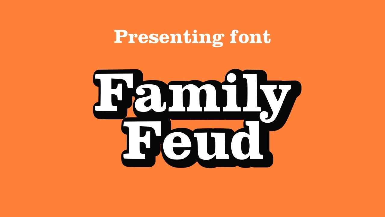
About Family Feud Font
We’re the team at Fontsbird, a creative type foundry with a deep love for typography. We’ve taken time to review the Family Feud Font because it’s bold, fun and perfect for big titles. We first spotted this typeface when browsing game show branding assets, and we used it on a mock television show poster. Working with it felt just right, the thick letters demand attention, the spacing feels friendly, and it gives energy to any design.
The original design roots lie in Clarendon Bold, a slab serif font first created by Hermann Eidenbenz in 1953. Clarendon Bold is a serif display typeface with strong, sturdy forms. Designers over the years have loved its mix of strength and clarity. The Family Feud logo adapted that style to carry excitement for a fun family game show. We recreated a faithful version of that style for modern use, staying true to the spirit of the American television game show.
Features of This Font
The Family Feud Font has a number of standout features that make it shine in titles, logos and display text:
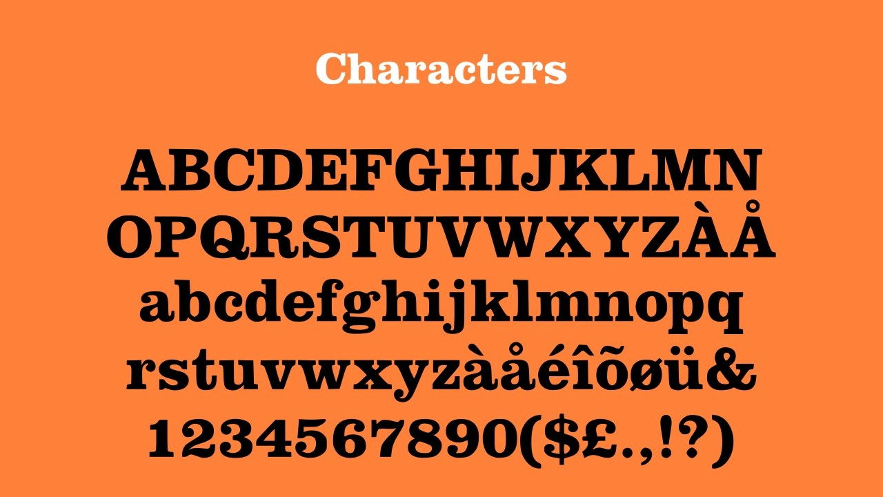
- Strong slab serif strokes: The heavy, blocky parts of each letter give solid weight. These thick strokes echo the original Clarendon Bold form.
- Rounded edges and friendly curves: The softer outlines balance the bold weight so the font doesn’t feel harsh.
- Balanced spacing: There’s room between letters so words stay legible even in tight layouts or big headings.
- High contrast in weight: Light and dark strokes in each letter help the text stand out on busy backgrounds.
- Versatile for print and screen: It works well in PNG graphics, posters, TV mockups and digital assets.
- Faithful to the Family Feud logo style: It mirrors the look used by that iconic brand where two families compete to guess the most popular answers giving your design instant familiarity.
- Bold, attention-grabbing: Because it’s built for display, it’s perfect for titles, banners, show headers or branding.
- Modern adaptation with classic roots: It bridges the past, the original Clarendon Bold, with current needs. A free download option means you get strong style without excessive cost.
Because this is a typeface designed for display use, it’s ideal when you want something that shouts “look here” without losing clarity. That’s the magic of this family feud font free download we offer.
Where Can You Use This Font?
You can use Family Feud Font in lots of fun and practical places. For example, it’s ideal for designing a logo for a quiz night or a retro-themed show. The style evokes American television, so if you’re doing a poster for a local game show, the font makes your title feel like it belongs on screen. It also works great for headings on websites, banners, social media graphics, and even PNG overlays on images.
Because it’s bold and legible, this font fits well on t-shirts, stickers, event signs, and packaging. Use it when you want to bring that “game show excitement” into your design. Say you run a competition or family event, you can create an eye-catching banner that says “Family Feud Night”, and the family feud logo look and feel will resonate. It also pairs well with simpler body fonts, so you could set the heading in Family Feud Font while the rest of the text is in a clean sans serif.
Given its slab serif roots, it looks strong whether printed on paper or shown on screen. Use it on stage backdrops, TV show mockups, YouTube thumbnails or Twitch overlays. Designers love it when type gives character, and this font has that in spades. And since our version supports a free download, creators on a budget can enjoy that bold brand style without breaking the bank.
Font License
Our Family Feud Font is free for personal and non-commercial use. This is the free download option. For commercial projects, like selling products or using it in advertisements, we ask you to get a licence from Fontsbird. That way, you stay legal and we keep designing more fonts you’ll love.


