
About Costco Font
The Costco Font is best known from the bold logo of the Costco Wholesale brand. It has strong, clear letterforms that feel friendly yet powerful. When we study this style, we look at shape, spacing, and how it works in real brand settings.
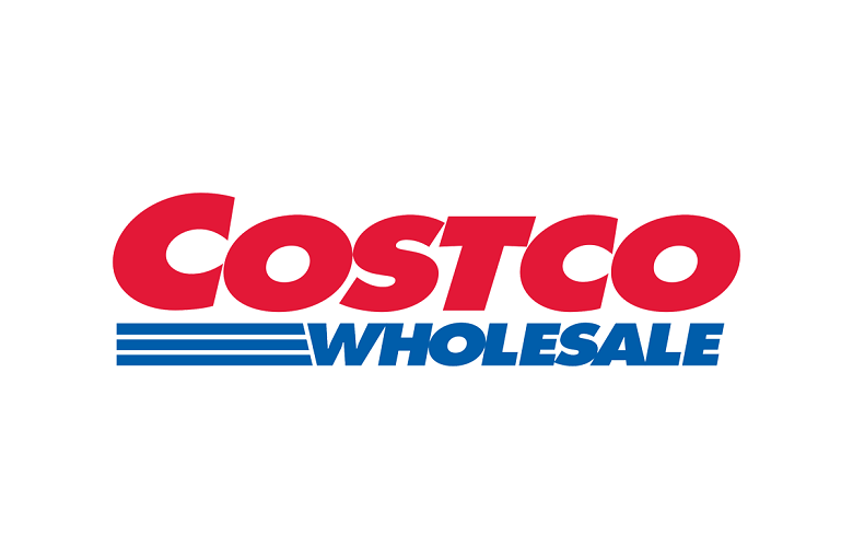
We first looked at this bold typeface through its logo use on stores, signs, and print ads. The style stands out as a clean display font that is easy to read from a distance. Its simple structure and solid forms help it carry a strong retail and warehouse identity.
Designers often search for styles close to the Costco Font when they want a big, trusted feel in their own work. The heavy strokes and compact shapes give a sense of value and reliability. For us, it is a useful case study in bold brand typography.
Font Style & Design Analysis
The original Costco Font used in the logo is a custom sans-serif style. It is not clearly credited to a public designer or foundry, so we treat it as proprietary branding work. Its look sits between a geometric and a classic retail display typeface.
The letters are wide, with thick strokes and tight tracking, which gives a strong blocky feel. Straight horizontal cuts on the terminals add a clean, modern edge. The simple, uniform shapes help the font style stay readable even when seen at speed on roadside signs or busy packaging.
There is a subtle sense of motion, helped by the angled stripe under the main logo lettering. While that stripe is part of the graphic mark, not the core font family, it supports a fast, warehouse-club mood. Overall, the design feels practical, value-driven, and ideal for bold brand identity work.
Where Can You Use Costco Font?
Because the real Costco Font is custom and tied to a major brand, we do not suggest copying it directly for your own logo. Instead, we look at similar bold sans-serif display fonts for use in headings, posters, thumbnails, and social media graphics that need strong impact.
This kind of heavy, simple typeface works best at large sizes, such as banners, hero titles, and packaging fronts. At very small sizes, thick strokes and tight spacing can feel crowded, so body text is not ideal. For clear product pricing, bold offers, and big web headers, this style performs very well.
Projects aimed at retail, discount offers, supermarket themes, or warehouse visuals can all benefit from a font with a Costco Font-style presence. It sends a signal of scale, value, and trust. For designers working on strong visual identity systems, similar fonts can anchor a bold, no-nonsense look.
Font License
The official Costco Font used in the brand logo is a custom, protected design. It is not a free public font for personal or commercial use. If you choose any similar typeface, always check the official licence or source carefully before using it in paid or client projects.


