
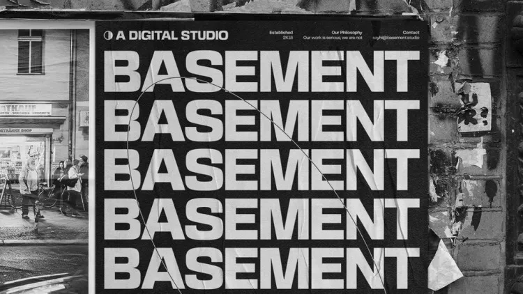
About Basement Grotesque Font
The Basement Grotesque Font is a bold, heavy display typeface that feels raw, loud, and modern. We first noticed it while studying strong poster lettering and dramatic title designs. Its chunky shapes and tight rhythm create a strong voice that stands out in crowded layouts.
At Fontsbird, we explored this typeface for its striking visual identity potential and its clear link to modern brutalist design. It mixes sharp geometry with rough charm, so every word looks cinematic and intense. This makes the font perfect for designers who want letterforms that feel powerful, edgy, and unforgettable.
Font Style & Design Analysis
The Basement Grotesque Font is a strong sans-serif display font with a brutalist twist. It is not clearly credited to a single designer or foundry in every source, so we always advise checking the original type release. Still, its style follows the lineage of bold grotesque typefaces built for impact.
Its letterforms are wide, heavy, and slightly awkward in a good way. The counters feel tight, and the spacing is compact, so words form dense blocks of colour. The vertical strokes look almost industrial, while curves stay stiff and geometric. This tension gives the font a rough, urban personality.
On the page, the font carries a dramatic, almost cinematic typography mood. It shines in large sizes, where the thick strokes and quirky shapes become clear. The overall weight suggests confidence, rebellion, and grit, which is ideal for bold branding, loud posters, and contemporary cultural projects that want to look strong and unapologetic.
Where Can You Use Basement Grotesque Font?
The Basement Grotesque Font works best as a hero display font for titles, logos, and headers. It suits album covers, event posters, streetwear branding, and striking social media graphics. Because it is so heavy, we recommend pairing it with a simple secondary typeface for body text to keep designs readable.
At large sizes, every detail of the font’s bold letterforms shows clearly, giving layouts a strong rhythm and visual punch. At very small sizes, the thick shapes can feel cramped, so we see it as a font for headlines rather than long copy. Use it where you want the message to shout, not whisper.
This typeface suits audiences who enjoy contemporary culture, street-inspired visual identity, music, film, and fashion. It feels right at home in modern brand systems, teaser posters, and expressive thumbnails. When used with good spacing, it can anchor a full design system and give your work a clear, memorable voice.
Font License
Licensing for the Basement Grotesque Font can vary between websites and distributors. Always check the official source for terms on personal and commercial use. Before using it in client work, logos, or paid campaigns, read the licence carefully and confirm that your chosen use is fully allowed.


