
About Baloo 2 Font
The Baloo 2 Font is a joyful, rounded sans-serif typeface with a friendly voice and bold presence. We see it often in playful branding, children’s content, and fun digital products, where soft curves and thick strokes help words feel warm, open, and easy to read.
At Fontsbird, we first noticed Baloo 2 Font in bright mobile interfaces and bold web headers. We then studied its full typeface family, testing it across headings, short paragraphs, and logos. It stands out because it combines strong, chunky shapes with clear, modern letterforms that still feel relaxed and human.
This mix of power and charm makes Baloo 2 a favourite for designers who want impact without harsh lines. It supports expressive visual identity work, animated titles, and poster lettering that needs big personality while staying clean and approachable.
Font Style & Design Analysis
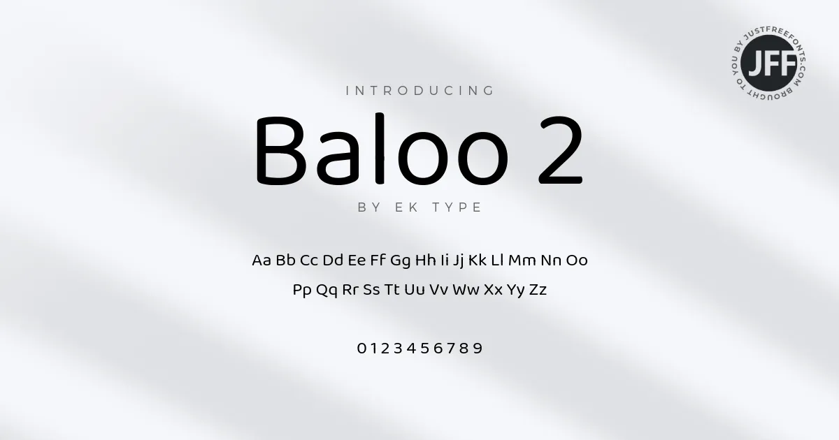
This is a sans-serif font designed with bold, rounded forms and a soft, friendly mood. The overall direction is playful yet controlled, giving a strong silhouette while keeping details simple. It looks modern and digital-first, but its chunky shapes also hint at classic cartoon and signage styles.
The exact designer and foundry for Baloo 2 are not clearly credited in all sources we see. Because of this, we always suggest checking a trusted font library or the original release page for the most accurate creator and type foundry details before using it in serious client work.
Visually, the letters have wide counters, generous spacing, and smooth curves that almost feel inflated. The heavy weight makes it ideal for titles, badges, and buttons. Its rhythm is steady, so even dense words stay legible. The mood is upbeat and slightly cartoon-like, perfect for youthful branding and light cinematic typography.
Where Can You Use Baloo 2 Font?
Baloo 2 Font works best in display roles where we want bold, happy energy. Use it for playful logos, children’s brands, learning apps, and event posters. It also fits YouTube thumbnails, gaming channels, and social media graphics where a chunky sans-serif headline can grab attention fast.
At large sizes, this typeface shines in big titles, hero banners, and poster lettering, because the soft shapes feel strong but never sharp. At smaller sizes, short labels and UI elements still read well, though we would avoid very long blocks of body text. Its weight and rounded forms are most powerful in short, punchy lines.
Projects aimed at kids, families, lifestyle, food, and entertainment benefit the most from Baloo 2. Brands that want to feel inclusive, friendly, and modern can use this font family across packaging, stickers, and digital campaigns. It also pairs nicely with a neutral text font for more serious paragraphs beneath bold, fun headings.
Font License
Before using Baloo 2 Font in any project, we suggest checking the official source for its latest licence details. Many users can work with it freely for personal use, but commercial projects may have extra rules. Always read the licence carefully and confirm terms before client or paid work.


