
About Aria Text Font
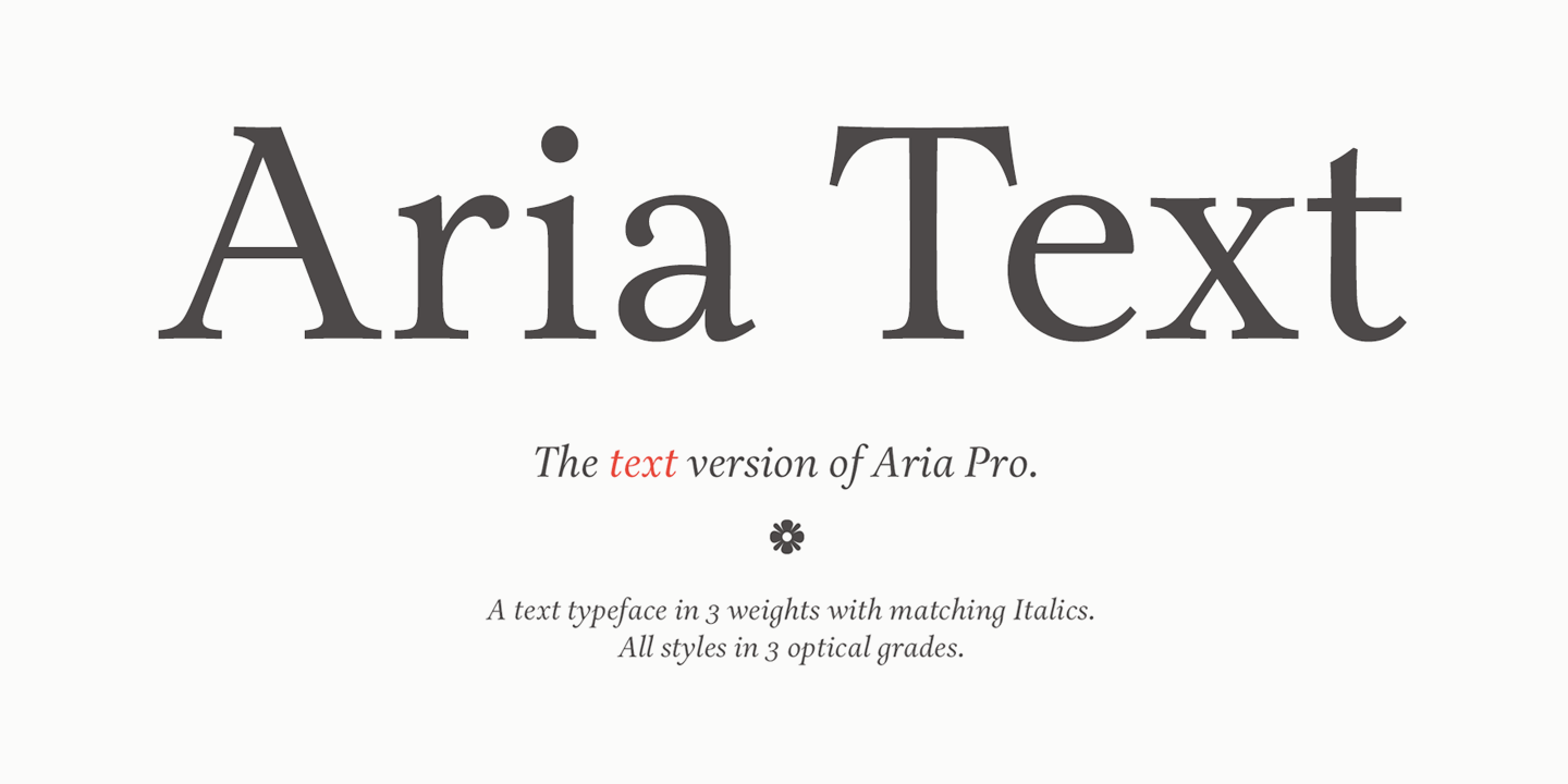
Aria Text Font is a calm, classic serif that feels clear and grown-up. The letters have gentle curves and neat strokes, which makes this typeface feel smart but friendly. We love how it balances soft tapering serifs with firm structure for strong, everyday reading layouts.
We first noticed Aria Text Font while comparing text faces for long articles and book-style pages on Fontsbird. It stood out because its letterforms stay sharp on screens yet still look warm in print. We saw it hold detail in small sizes, which is rare for a subtle text serif.
What makes this font family special is how steady and relaxed it feels at length. It brings a touch of editorial design into normal documents and blogs. If you want a quiet, confident voice for reading, Aria Font gives structure without stealing attention from your words.
Font Style & Design Analysis
Aria Text Font is a classic serif typeface designed for body copy and long-form reading. It sits between traditional book faces and modern digital text fonts. The exact designer or foundry is not clearly credited, so we treat it as a practical working font rather than a famous showpiece.
The basic letterforms have moderate contrast between thick and thin strokes. The serifs are tidy and slightly bracketed, which keeps the reading rhythm smooth. Counters stay open, and the x-height feels generous, so words stay legible on screens, tablets, and printed pages with tight line spacing.
In mood, Aria Text Font feels bookish and calm, not flashy. It leans more towards editorial typography than bold headline work. Used in titles, it can still support a soft cinematic typography feel when paired with a contrasting display font, making it useful for subtle posters and refined visual identity systems.
Where Can You Use Aria Text Font?
Aria Text Font works best where clear reading matters. It suits long-form blogs, articles, book-style layouts, and editorial spreads. For branding, it can support serious sectors such as education, culture, and publishing. Aria Font gives websites a calm, trustworthy voice without feeling cold or mechanical.
In print, this typeface performs well in body copy, reports, manuals, and brochures. At smaller sizes, the open shapes keep letters from blurring together. At larger sizes, we see more detail in the serifs and curves, which can bring a classic tone to covers, chapter titles, and section headings.
For digital work, Aria Text Font is handy for articles, reading apps, and clean interface typography. It pairs nicely with a bold display font for thumbnails, gentle social media quotes, and minimalist posters. Audiences who enjoy thoughtful, text-led content will appreciate its quiet, serious, and readable style.
Font License
Before using Aria Text Font for branding, client work, or any paid project, always check the official font licence from the original source. Some licences allow personal or student use only, while others cover full commercial use, so it is vital to confirm the terms yourself.


