
About New York Font
The New York Font brings a touch of classic city charm to any layout. When we first saw this typeface used in sleek magazine covers and story titles, we were struck by its calm authority. It feels timeless, stylish, and ready for serious editorial work.
At Fontsbird, we study how fonts behave across print and screen, so we spent time looking at how New York Font handles long text, bold headers, and small captions. It stands out because the letters feel carefully tuned. The shapes are elegant but still strong enough for everyday reading.
Font Style & Design Analysis
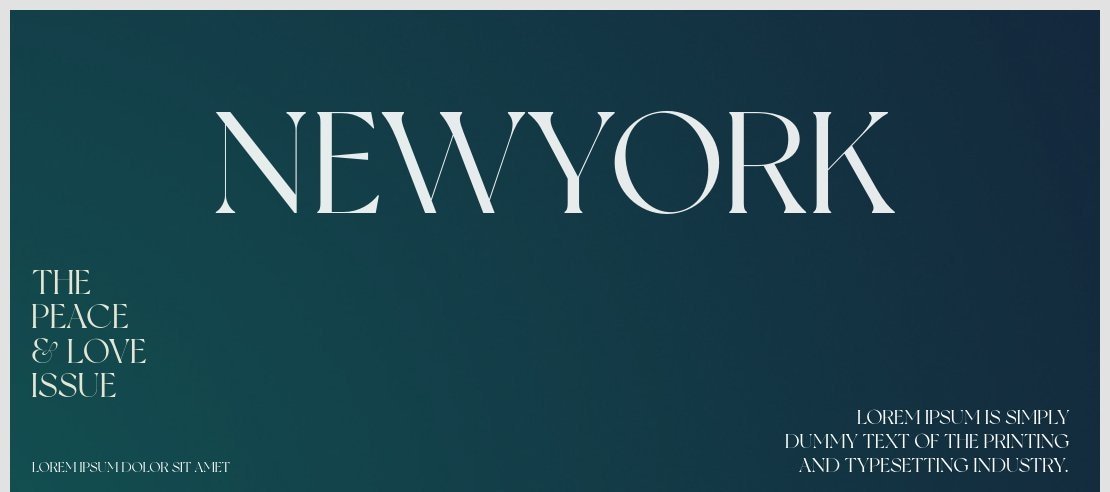
This is a serif font with a refined, bookish feel. Each letter has small finishing strokes that guide the eye along the line, which helps reading stay smooth and calm. The overall design leans towards classic editorial style, ideal for serious content with a modern polish.
The exact designer or foundry of New York Font is not clearly credited across common font sources. Because of this, we always suggest checking the original download source for any available notes on authorship, updates, or design background before using it in a big project.
When we study the letterforms, we notice a gentle contrast between thick and thin strokes, giving it a soft, literary tone. The spacing feels balanced, so text blocks look neat on both page and screen. Used as a display font in titles, it carries a subtle cinematic typography flavour that suits posters and story-driven visuals.
Where Can You Use New York Font?
New York Font works well in branding that aims for culture, trust, and calm authority. Think book covers, lifestyle magazines, boutique shop identities, and elegant portfolio sites. It also suits film posters, title cards, and social media graphics that lean into classic, story-led design.
At large sizes, the serif shapes show their full character, giving headlines and hero images a strong visual identity. At smaller sizes, the tidy proportions help body text stay readable, though we suggest testing on mobile screens to be sure the thin strokes stay clear enough.
We see this typeface fitting well for creative studios, writers, photographers, and brands that value subtle luxury over loud, flashy visuals. It can support thoughtful blog posts, design case studies, newsletters, and printed materials where a steady, trustworthy voice is key.
Font License
Before using New York Font for client work or any commercial project, always check the official licence from the original source. Many fonts allow personal use for free, but commercial rights can differ. Reading the terms carefully protects both your work and your clients.


