
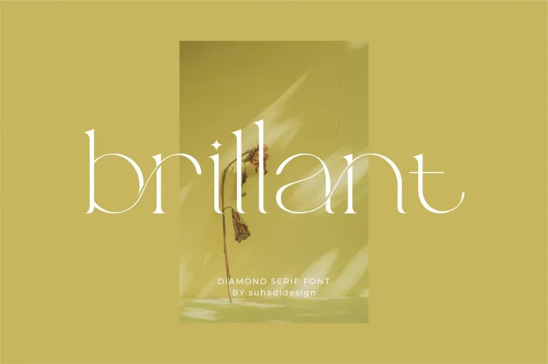
About Brillant Font
At Fontsbird, we first noticed Brillant Font while studying bold movie-style title typography. Its letters feel sharp, bright, and a little dramatic, like a name on a classic film poster. The strong shapes pull the eye at once, which makes it perfect for clear, loud headlines.
We spent time looking at its letterforms, spacing, and rhythm across different layouts. This helped us see where Brillant Font shines and where it needs space to breathe. It stands out because each character feels polished and confident, ideal for striking visual identity work.
For any designer who loves expressive display fonts, this typeface offers a mix of drama and control. Used well, it can turn simple words into a strong visual story. That makes Brillant Font a useful choice when you want your text to lead the whole design.
Font Style & Design Analysis
Brillant Font works as a bold display typeface rather than a quiet text font. It feels built for titles, logos, and short phrases that must stand out. We could not find a clearly credited designer or foundry, so its exact origin is unclear and should be checked on the source you use.
The shapes look firm and confident, with strong vertical lines and well-defined curves. The letterforms often sit quite close, which gives a tight, energetic look. Weight is on the heavier side, so the font carries a solid, almost cinematic presence, especially on dark backgrounds and high-contrast poster layouts.
The overall mood is bold, modern, and slightly glamorous. It can feel like high-end branding when paired with clean sans-serif partners, or like classic cinema when used alone as the hero type. Careful spacing and generous margins help Brillant Font stay readable while keeping its dramatic character strong.
Where Can You Use Brillant Font?
We see Brillant Font working best in striking branding, film-style posters, and bold social media graphics. It suits YouTube thumbnails, hero banners, and cover art where a few powerful words do the talking. The font brings a sense of event, making simple titles feel like a big moment.
At larger sizes, the detailed letterforms and heavy strokes look clean and readable. On smaller body text, that same weight can feel crowded, so we suggest using a simpler supporting typeface for long paragraphs. Let Brillant sit in headlines, while another font handles the fine print for balance.
Creative teams designing for fashion, film, music, or gaming can gain from this bold display font. It speaks well to younger, style-aware audiences who enjoy strong, cinematic typography. Used with good colour and imagery, Brillant Font can help shape a clear, memorable visual identity across print and digital media.
Font License
Licensing for Brillant Font can vary between websites and vendors. Always check whether your chosen source allows only personal use or also full commercial projects. Before using it in client work, products, or large campaigns, review the official font licence terms carefully and keep a record of them.


