
About Berliner Font
The Berliner Font feels bold, urban, and full of character. When we first saw its strong letterforms, it reminded us of old city posters and gritty street signage. It has a striking look that fits powerful layouts and dramatic titles with a clear visual punch.
At Fontsbird, we study how type behaves in real designs, not just on a blank screen. We tested Berliner Font in mock film posters, album covers, and social media graphics. The font stood out because it builds a strong visual identity quickly, even with only a few words on the page.
This typeface suits designers who love clear, heavy shapes and cinematic typography. The mood feels slightly industrial yet creative, which makes it perfect for bold branding experiments. Every character seems built for attention, so our team sees it as a natural choice for standout display font work.
Font Style & Design Analysis
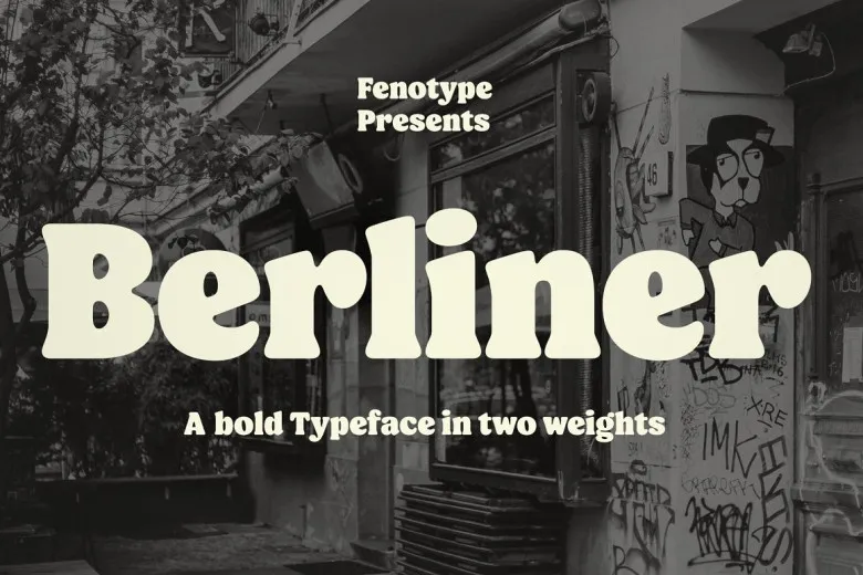
The exact designer and original foundry for Berliner Font are not clearly credited, which we always treat with care. From its structure, we would describe it as a strong display typeface with bold, blocky shapes and a clear, readable build. It favours impact over subtle detail.
The letterforms look wide and heavy, often with tight spacing that packs words together. Strokes feel thick and confident, giving the font a sturdy, urban mood. This shape language works well for loud titles, posters, and other pieces that need a punchy headline style more than body text comfort.
Viewed up close, Berliner Font has an almost poster-print feel, like classic cinema lettering or underground gig flyers. The weight of the letters creates strong contrast against empty space, which helps designers build drama. Overall, it is more about energy and attitude than quiet, neutral typography.
Where Can You Use Berliner Font?
We see Berliner Font working best in bold branding, posters, and social media titles. It fits music artwork, event flyers, film-inspired graphics, and edgy thumbnail designs. If your project needs a loud voice, this typeface can help your message stand out from crowded feeds and busy streets.
Because the letters are thick and tight, this font family shines at large sizes. It looks strongest on covers, banners, hero images, and short title lines. At very small sizes, the heavy weight can feel cramped, so we recommend pairing it with a simpler supporting typeface for paragraphs and captions.
Designers building work for teens, young adults, creative brands, or independent events will get the most from this bold display font. It suits projects with an urban, alternative, or industrial tone. Used with care, it can give a strong, consistent visual identity across print, web, and social channels.
Font License
As with any strong typeface, the licence for Berliner Font can differ between sources. Some versions may allow personal use only, while others permit full commercial projects. We always suggest checking the official seller or publisher and reading the current font licence before using it in paid client work.


