
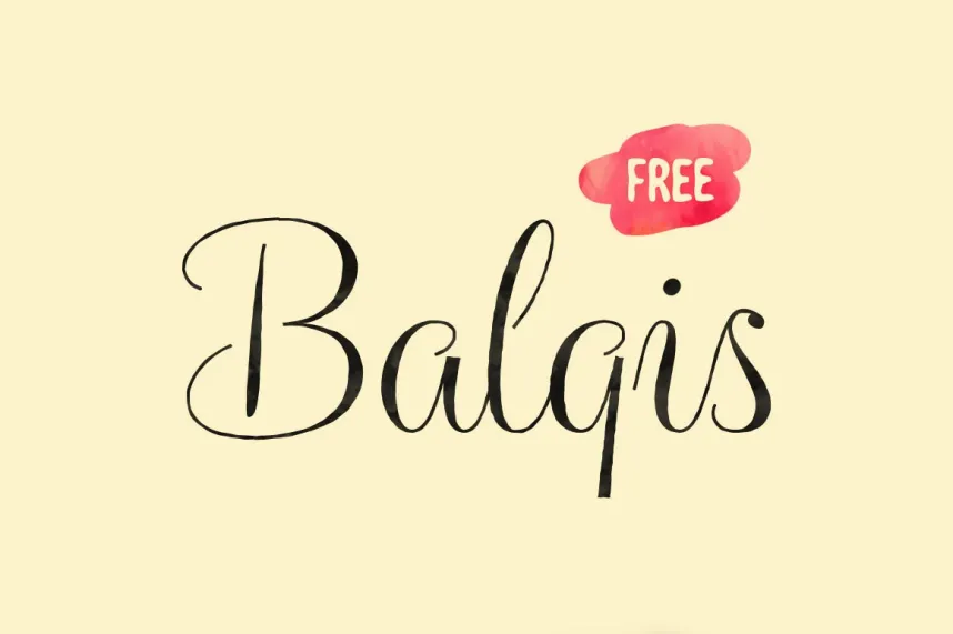
About Balqis Font
We see Balqis Font as a soft, romantic script typeface with a handwritten feel that suits calm, poetic stories. When we first studied it on wedding suites and lifestyle blogs, the flowing letterforms and sweeping tails stood out right away. It looked graceful yet still warm and human.
Our team at Fontsbird explored how this script behaves in real layouts, from small logos to large headline art. We liked how the loose, airy strokes make each word feel personal, almost like a quick signature. This mix of ease and elegance helps the font shine in modern visual identity and soft, cinematic designs.
Font Style & Design Analysis
Balqis Font sits in the world of flowing script and casual calligraphy, with a strong handwritten rhythm rather than strict classic rules. The creator is not clearly credited in all sources, so we treat it as an independent typeface and always suggest checking the original release notes where possible.
The letters have long, loose strokes, light weight, and plenty of open space, so words feel airy and relaxed. Many characters use playful entry and exit swashes, which give the letterforms a dancing motion. This makes the font feel dreamy and slightly boho, instead of sharp or corporate.
Because of its delicate lines and varied stroke width, this script works best as a display font for titles, short phrases, or hero text. It brings a soft, almost cinematic typography mood, perfect for overlays on photos, poster lettering, and branding where emotion and intimacy matter more than strict readability.
Where Can You Use Balqis Font?
We like using Balqis Font for romantic branding, wedding invitations, lifestyle logos, and soft editorial covers. It suits beauty products, handmade shops, photographers, and any project that needs gentle charm. The font pairs well with simple sans-serif text, giving contrast between calm titles and clean body copy.
At large sizes, the loose script style feels expressive and elegant, great for posters, book covers, YouTube thumbnails, and social media headers. The fine strokes and sweeping curves show clearly there. At very small sizes, some thin lines can fade, so we suggest using it mainly for headings, not dense paragraphs.
Different audiences respond well to this handwritten lettering, especially people drawn to minimal, feminine, or rustic design. Lifestyle brands, wedding planners, craft businesses, and boutique hotels can all use this typeface to build a soft, personal visual identity. With careful spacing and contrast, it also works on web banners and printed packaging.
Font License
The licence for Balqis Font can vary by source, and some uses may be limited. Always check the official licence for personal and commercial projects, including logo or product use. We strongly advise reading the current terms from the original distributor before using it in any paid client work.


