
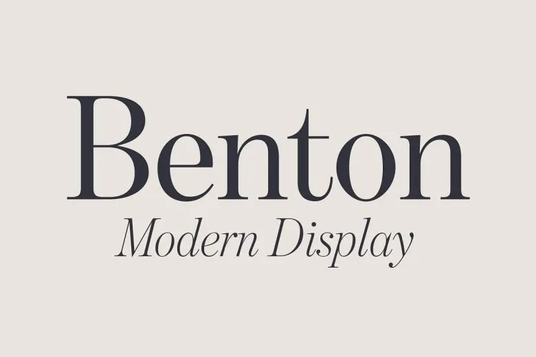
About Benton Modern Font
Benton Modern Font is a refined serif typeface with a calm, confident voice. We first noticed it while exploring classic newspaper layouts and elegant book designs on Fontsbird. The letters feel balanced and clear, giving every word a sense of quiet strength and careful typography.
We studied this font by testing it in mock magazine spreads, editorial layouts, and simple branding ideas. Its sharp serifs and gentle contrast let text feel both serious and friendly. This mix of tradition and clarity makes Benton Modern Font stand out for designers who love long reading and polished visual identity work.
Font Style & Design Analysis
Benton Modern Font belongs to the family of modern serif typefaces, with clean vertical stress and crisp details. The original design is widely linked to the Font Bureau, and it follows the spirit of classic newspaper and book faces. The credited authorship can vary, so it is not always clearly listed in every source.
The letterforms show strong contrast between thick strokes and fine hairlines, a key trait of modern serif design. The serifs are sharp yet measured, giving text a tidy edge without feeling cold. Tight but even spacing supports smooth reading, whether we set a bold headline or a delicate caption in this font family.
In mood, the typeface feels serious, informed, and slightly cinematic, like credits on a thoughtful film or titles on a quality documentary poster. It works well for editorial typography, financial reports, and cultured branding. When used with good hierarchy, Benton Modern Font brings a sense of trust and long-term stability to any layout.
Where Can You Use Benton Modern Font?
We see Benton Modern Font shining in grown-up branding, magazines, book interiors, and news-style websites. Its clear structure makes it ideal for articles, essays, and long reports. For titles and taglines, the high contrast adds a smart, memorable edge without feeling overly decorative in modern visual communication.
At large sizes, the fine serifs and strong vertical strokes bring a classic display font quality to posters, editorial covers, and film-style title cards. At smaller sizes, careful drawing keeps the shapes readable, though very tiny body text may need generous line spacing. Used well, this font supports both print and screen typography.
Designers building trusted visual identities for schools, publishers, cultural venues, or thoughtful YouTube channels can all benefit from this typeface. It suits audiences who value clarity, depth, and tradition. For pitch decks, author brands, and documentary-style thumbnail typography, it sends a message of care and serious intent.
Font License
The licence for Benton Modern Font can change between vendors and platforms. Some sources may allow personal use only, while others offer full commercial rights. Before using it in paid client work or products, always check the official licence terms and trusted foundry or distributor.


