About Visby Round Font
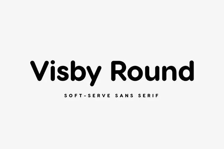
Visby Round Font is a clean, soft sans-serif typeface with smooth corners and a calm feel. We first noticed it while studying friendly branding design that needed clarity without sharp edges. Its rounded letterforms make words feel open, modern, and very easy to read.
At Fontsbird, we tested this font across simple logos, app screens, and bold poster lettering. The gentle curves and steady rhythm of the shapes stood out. We like how this font family balances a playful mood with serious structure, which is rare in rounded geometric designs.
Font Style & Design Analysis
Visby Round Font is a rounded geometric sans-serif with a clean, minimal voice. The original Visby typeface is commonly credited to designer Ryan Welch, though some listings for Visby Round are not always clear about its exact source. Because of that, we always suggest checking the official distributor before use.
The letterforms sit on simple circles and straight lines, with softened corners that remove harsh tension. Spacing is even, so text flows smoothly in both short titles and mid-length copy. The strokes feel balanced, so the font works in light, regular, and bolder weights without turning clumsy or too heavy.
On screen, this rounded typeface has a warm, almost cinematic glow, great for gentle visual identity work. In motion graphics and cinematic typography, the shapes give subtitles and titles a friendly, modern tone. It feels tech-ready yet human, which is powerful for brands that want trust and clarity together.
Where Can You Use Visby Round Font?
Visby Round Font shines in soft, modern branding, children’s products, wellness projects, and friendly tech interfaces. Its rounded display font style works well for logos, packaging, and clear app labels. We also like it for bold social media titles where a brand wants to look open and kind.
At large sizes, the smooth curves and simple geometry feel strong and confident on posters, thumbnails, and website hero text. At smaller sizes, the clean letterforms remain readable, though we suggest enough spacing so the shapes do not blur together. It suits both digital screens and everyday print layouts.
Designers can pair this typeface with a sharper serif for contrast, or keep a full rounded system for packaging and UI work. Young audiences, lifestyle brands, education platforms, and gentle healthcare projects all benefit from its relaxed mood. Used well, Visby Round Font can become the friendly voice of a whole visual story.
Font License
The licence for Visby Round Font can vary by source, especially between personal and commercial use. Some sites offer it for limited projects, others under paid terms. Before using it in any brand, product, or client work, always check the official licence and current rules on the distributor’s page.


