

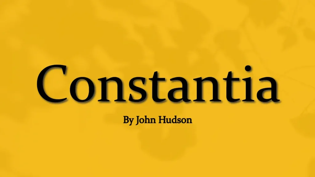

Constantia is a serif typeface that was designed by John Hudson and commissioned by Microsoft. It is part of the Clear Type Font Collection, which is a suite of fonts from various designers released with Windows Vista. This typeface was released in 2006, and its development began in 2003.
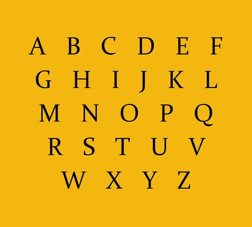
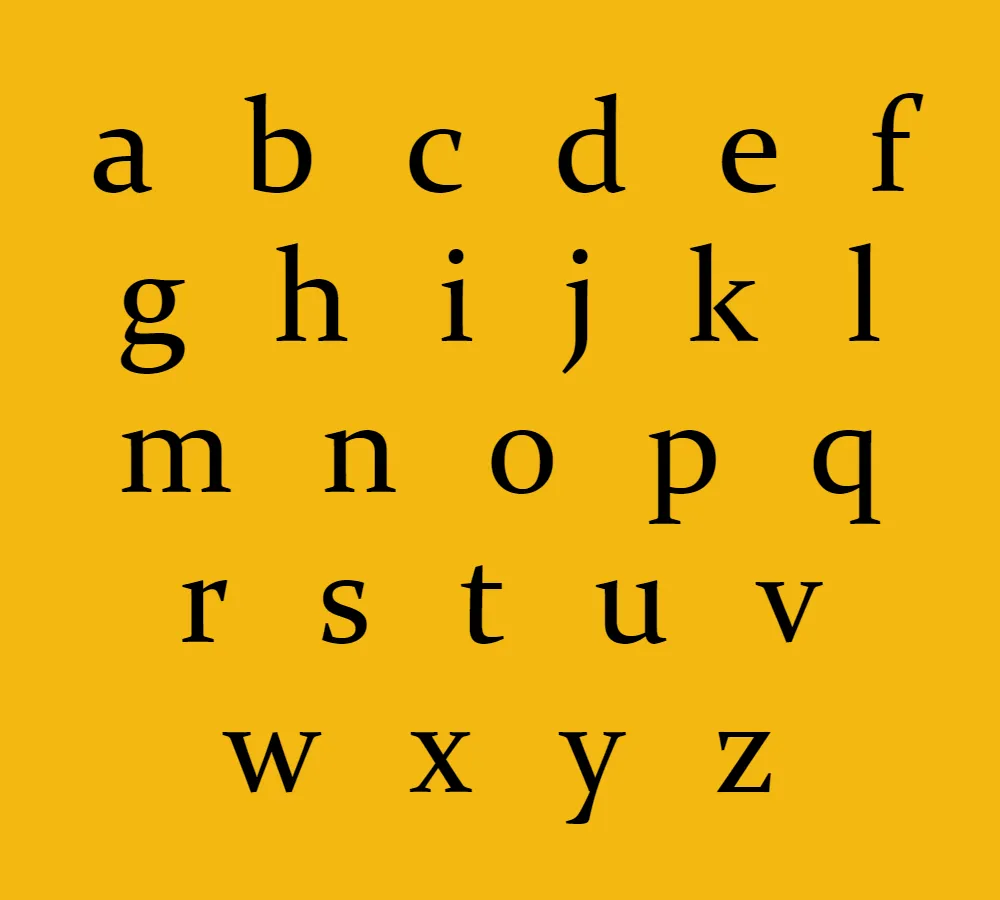
Constantia is a transitional serif design that is heavily influenced by Eric Gill’s Perpetua design. It has a modern and elegant look that is suitable for various types of content, including print and digital media. It is a highly legible typeface, which makes it an excellent choice for body text in books, magazines, and newspapers.
Design Features of Constantia
The Constantia typeface has several design features that set it apart from other serif typefaces. These include:
- High x-height: The x-height of the Constantia typeface is relatively high, which makes it highly legible even in small font sizes.
- Large counters: The counters of the Constantia typeface are relatively large, which helps to improve its legibility and readability.
- Sloping serifs: The serifs of the Constantia typeface slope slightly, which gives it a modern and elegant look.
- Open apertures: The apertures of the Constantia typeface are relatively open, which also helps to improve its legibility and readability.
Uses of Constantia Typeface
The Constantia typeface is suitable for various types of content, including:
- Body text: The high x-height and large counters of the Constantia typeface make it an excellent choice for body text in books, magazines, and newspapers.
- Headings and subheadings: The elegant look of the Constantia typeface makes it an excellent choice for headings and subheadings in various types of content.
- Websites: The Constantia typeface is highly legible and readable on digital screens, making it an excellent choice for websites.
- Corporate documents: The modern and elegant look of the Constantia typeface makes it an excellent choice for corporate documents, including reports and presentations.
Conclusion
The Constantia typeface is a transitional serif design that is heavily influenced by Eric Gill’s Perpetua design. It has a modern and elegant look that is suitable for various types of content, including print and digital media. Its high x-height, large counters, sloping serifs, and open apertures make it highly legible and readable, which makes it an excellent choice for body text in books, magazines, and newspapers. Its elegant look also makes it an excellent choice for headings, subheadings, websites, and corporate documents.
If you’re interested in using Constantia for your next project, it’s easy to download and install. Simply click the download button, where you can download the font for free. Once downloaded, you can easily install the font on your computer and start using it in your design projects.


