About Caros Font
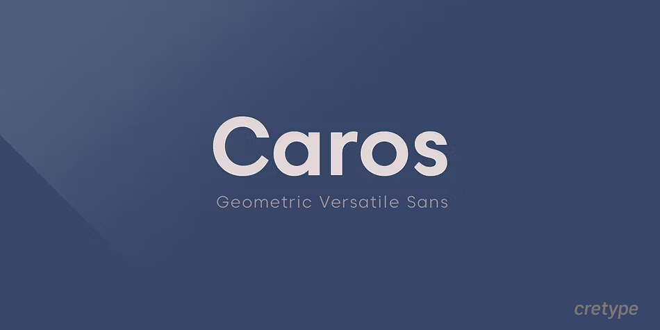
We see Caros Font as a clean, modern sans-serif typeface built for clear messages and strong brands. The letters feel open and friendly, with simple shapes that still look sharp and serious. It suits designers who want fresh, neat letterforms without fuss.
We first noticed this font family while exploring calm but confident styles for digital layouts and branding. On screen, the rhythm of each stroke looks smooth and balanced. In our tests, it stood out because the spacing, curves, and overall visual identity stay stable in many design settings.
Font Style & Design Analysis
Caros Font belongs to the modern sans-serif group, shaped for clarity and ease of reading. The design direction feels human and warm, not cold or mechanical. It works well when we need a neutral base that still has quiet personality in titles, text blocks, and user interfaces.
The exact designer or foundry for Caros Font is not clearly credited in common public sources, so we stay careful with attributions. What we can judge is the craft: steady stroke widths, clean terminals, and measured contrast. These features point to a thoughtful, professional approach to type design.
Looking closely at the letterforms, we see rounded curves, generous counters, and even spacing that supports long reading. The overall mood is calm and contemporary, with a slight geometric feel that suits cinematic typography, user interface labels, and branding systems. It gives layouts a tidy, organised tone without stealing attention.
Where Can You Use Caros Font?
We like Caros Font for flexible branding work, such as logos, wordmarks, and full visual identity systems. It performs well on social media graphics, YouTube thumbnails, and bold banner titles. The clear shapes also support editorial layouts, product packaging, and tidy poster lettering for modern campaigns.
At large sizes, the soft geometry of this typeface feels sleek and professional, ideal for hero headlines and display typography. At smaller sizes, the open forms keep text readable in web copy, app interfaces, and print leaflets. On screens, its even rhythm helps users scan content quickly without visual strain.
Projects that need a friendly but grown-up tone benefit most from this font family. We recommend it for tech brands, lifestyle labels, education platforms, and clean corporate reports. It suits audiences who expect clarity and trust, while still enjoying subtle style in every line of typography.
Font License
Use of Caros Font can differ between personal and commercial projects, depending on the original source. Before using it in logos, client work, or paid products, we strongly advise checking the official licence details and downloading only from a trusted, legal provider.
Every project deserves a font that works as hard as you do, and Caros Font might be the quiet hero your next design is waiting for.


