About Mirador Font
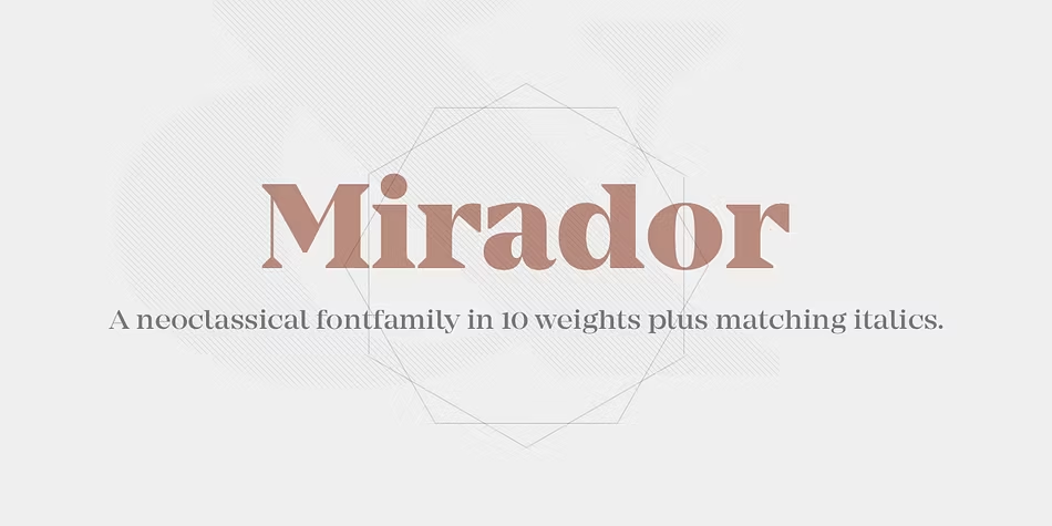
The Mirador Font is a bold, elegant serif typeface with a strong voice and tall, smooth curves. We first met it while exploring classic display font styles for dramatic posters and book covers. Its high contrast shapes feel refined yet powerful.
As we tested Mirador Font across layouts, we saw how well it supports rich visual identity work and cinematic titles. The sharp details and confident rhythm give every word a sense of story. It stands out in modern typography by mixing traditional charm with a clear, stylish edge.
Font Style & Design Analysis
Mirador Font sits in the family of modern serif typefaces designed for striking headlines and expressive titles. It is often described as a high contrast display serif. The exact designer or foundry is not always clearly credited, so we treat it as a refined, contemporary classic with similar traits.
The letterforms show slim stems, sharp serifs, and strong vertical stress, which gives the font a tall, elegant posture. Its generous contrast between thick and thin strokes creates a bright, crisp feeling on the page. This makes it ideal as a display font for dramatic headings and hero text.
Overall, the spacing in Mirador Font feels tight but controlled, which adds intensity to short words and names. The mood is high-end and slightly theatrical, perfect for cinematic typography, luxury branding, or fashion layouts. Used with care, it adds a confident, editorial edge to any design system.
Where Can You Use Mirador Font?
We see Mirador Font shining in logo work, magazine covers, and bold branding for fashion, beauty, or lifestyle projects. Its tall forms and strong contrast make it perfect for poster lettering, book titles, and opening screens. It loves large sizes where the details can breathe.
On social media graphics or video thumbnails, the font gives a polished, cinematic feel with very little effort. Short words and names set in this typeface can become strong hooks for campaigns. For regular body text at small sizes, though, we suggest pairing it with a simpler sans-serif companion.
Designers building bold visual identity systems or dramatic layouts will benefit most from Mirador Font. It speaks well to audiences who enjoy luxury, film, art, fashion, and strong editorial style. Use it for headlines, pull quotes, and title cards whenever you want your message to look refined yet memorable.
Font License
Before using Mirador Font for personal or commercial projects, we strongly suggest checking the official font licence and trusted source. Different sites may offer different terms, so always confirm rights, limits, and embedding rules carefully before client work or large campaigns.


